




Fortuneo
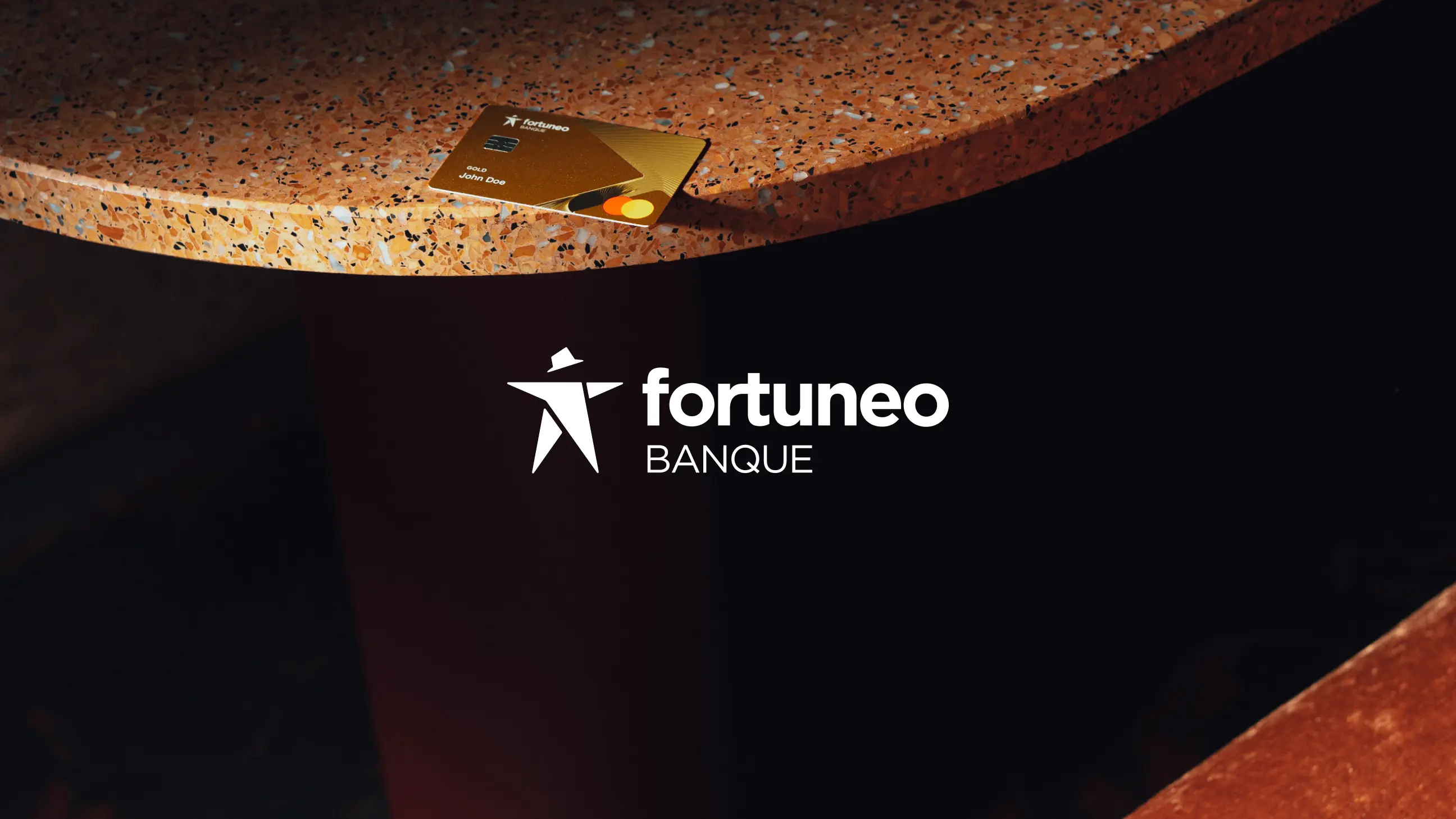
The brand felt functional when it needed to feel desirable. Anagram built the rebrand around Fortuneo's most distinctive strategic asset: the “0” symbolizing free banking. Instead of treating it as a simple feature, we transformed it into a core brand element, fluid, dynamic, scalable, and recognizable across every touchpoint. The rebrand covered strategy, copywriting, visual identity, design system, product design, motion, illustration, photography, video, and web development. Even the physical credit cards became part of the brand experience, produced with premium Pantone inks and tactile varnish finishes designed to reinforce the repositioning physically as well as visually.
+45% subscription funnel entry+27% prospects starting a project+63% documents submitted+77% awareness and consideration