Wastetide: Branding for the new economics of industrial waste
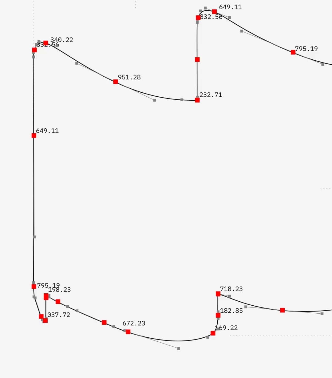
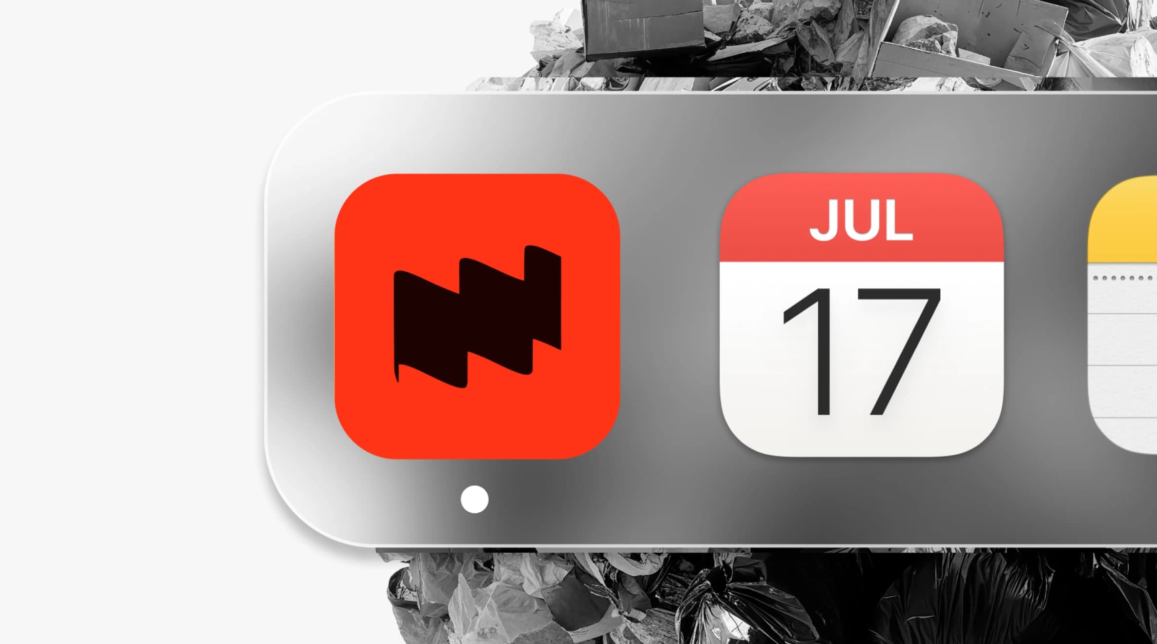
Logo Concept
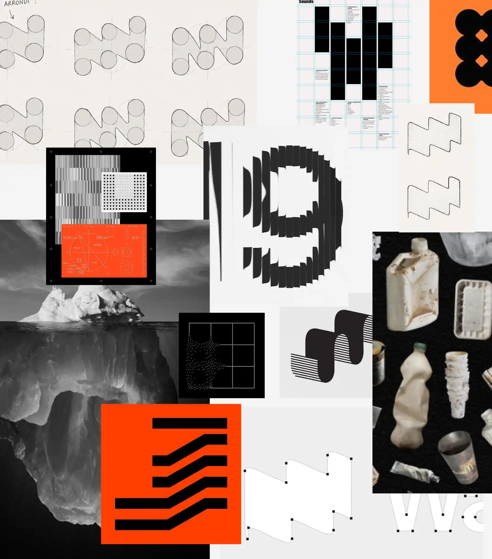
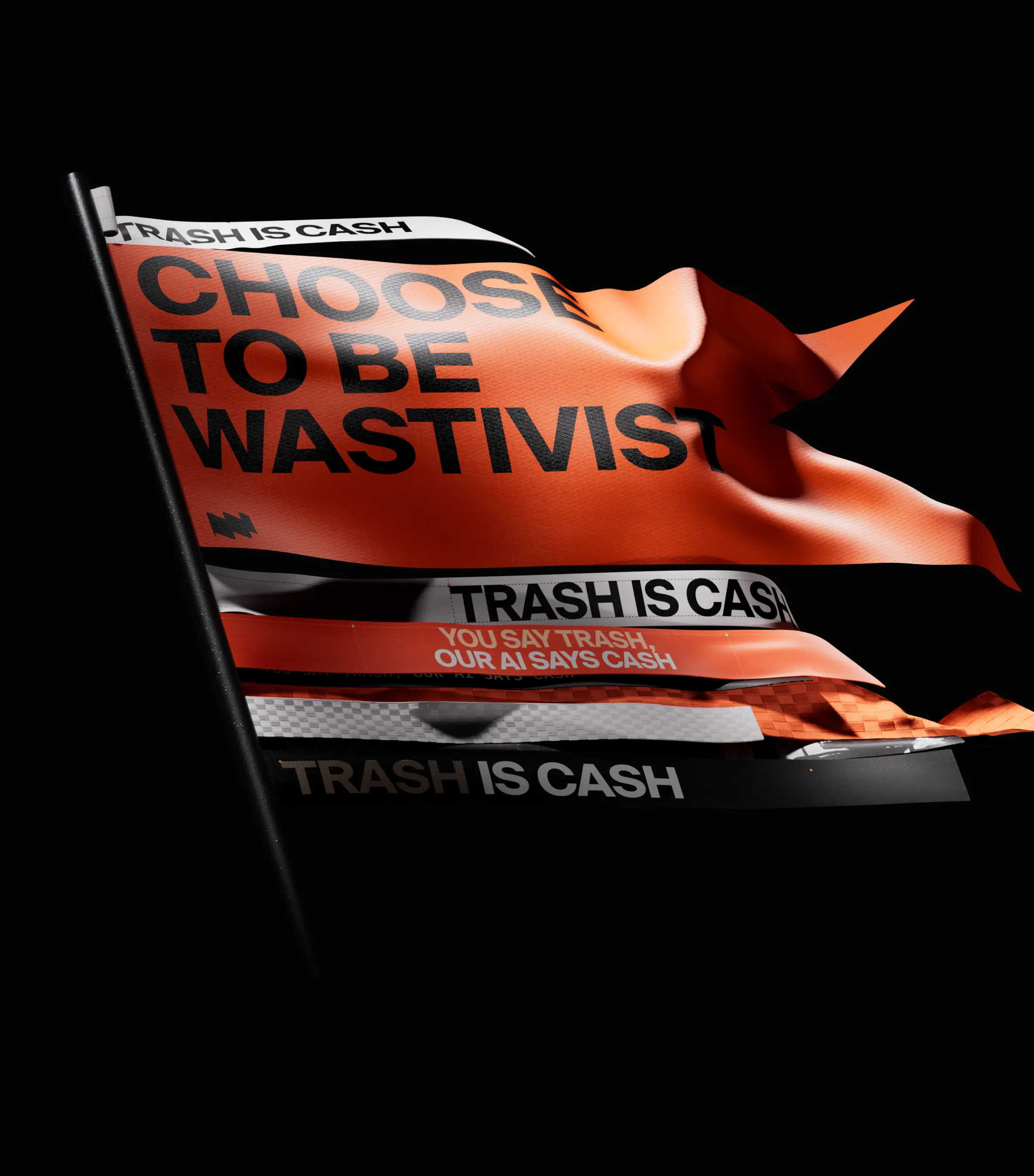
The flag represents identification and discovery the ability to locate hidden opportunities within industrial waste streams. The wave symbolizes the tide, a continuous flow of materials, resources and transformation.
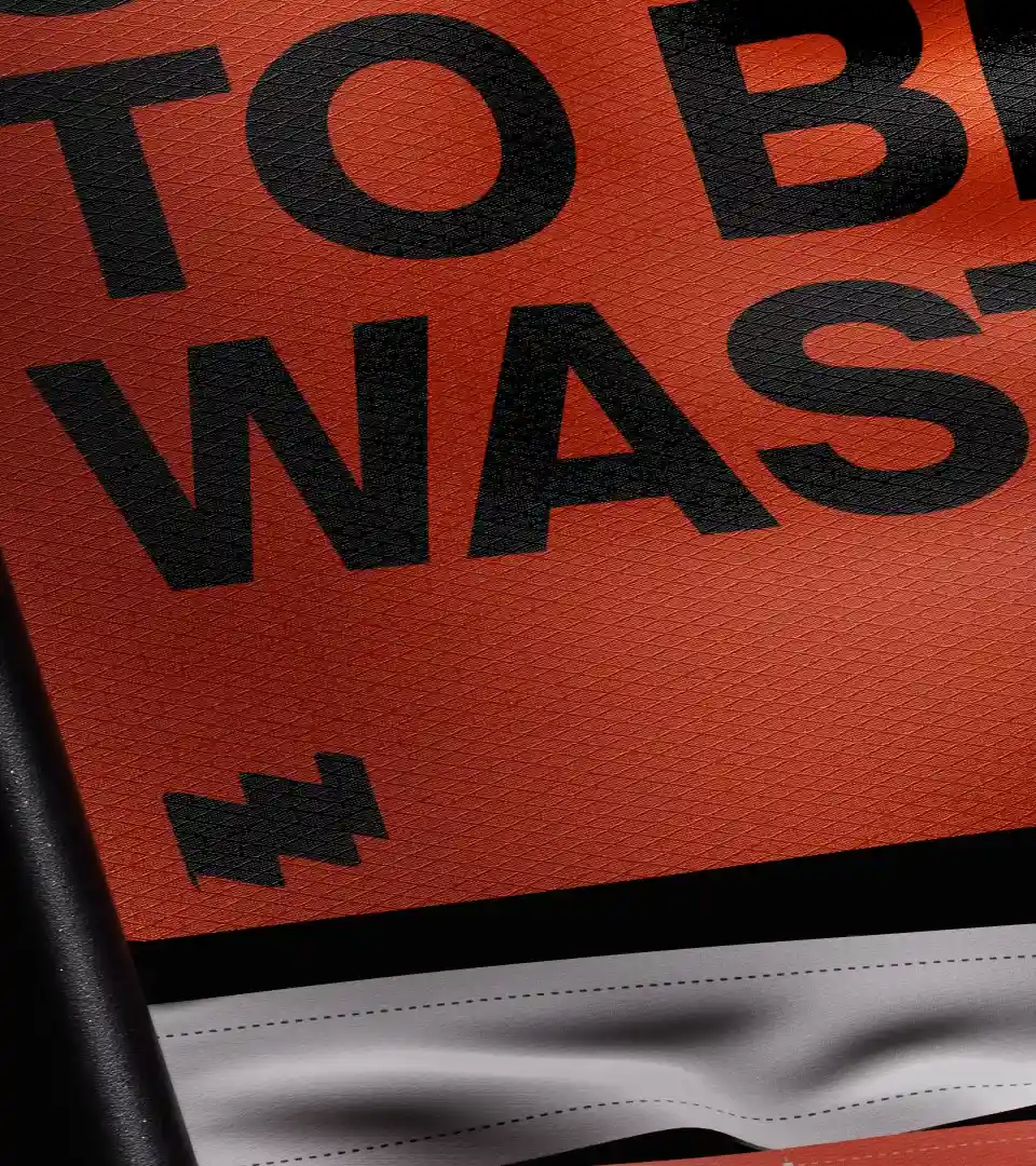
The ascending line embodies progress, growth and the creation of value over time. Combined with the initial “W”, these elements merge into a single mark that captures Wastetide's core promise: turning overlooked waste into measurable opportunity. More than a logo, the symbol acts as a visual equation a synthesis of detection, transformation and value creation.
Core Concept
The identity is built around three core principles.
The iceberg represents the contrast between visible waste and the hidden value it contains, whether in the form of materials, data or economic opportunities.
The wave symbolizes a shift in perspective. It embodies movement, awareness and the transformation of waste into a resource.
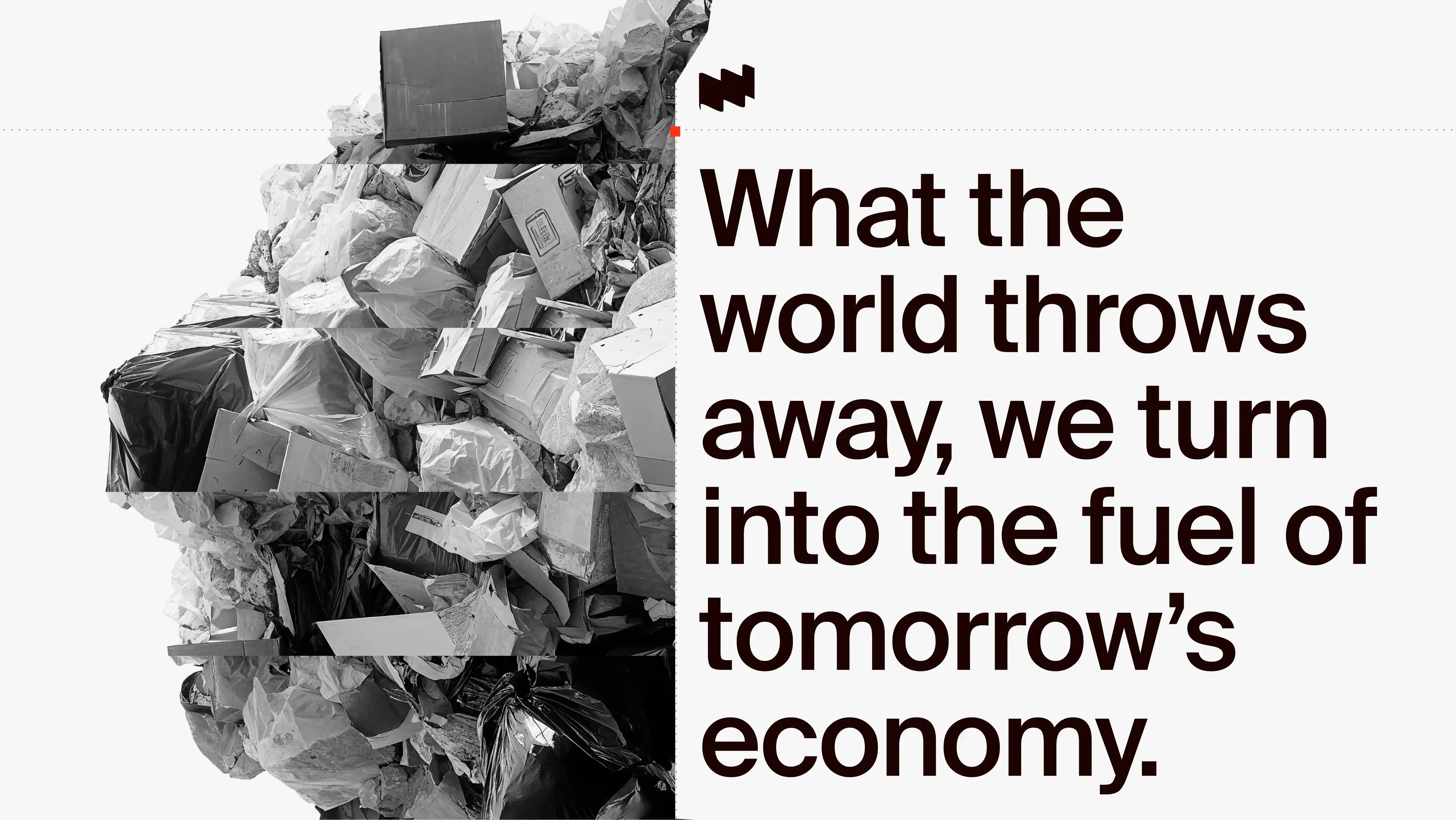
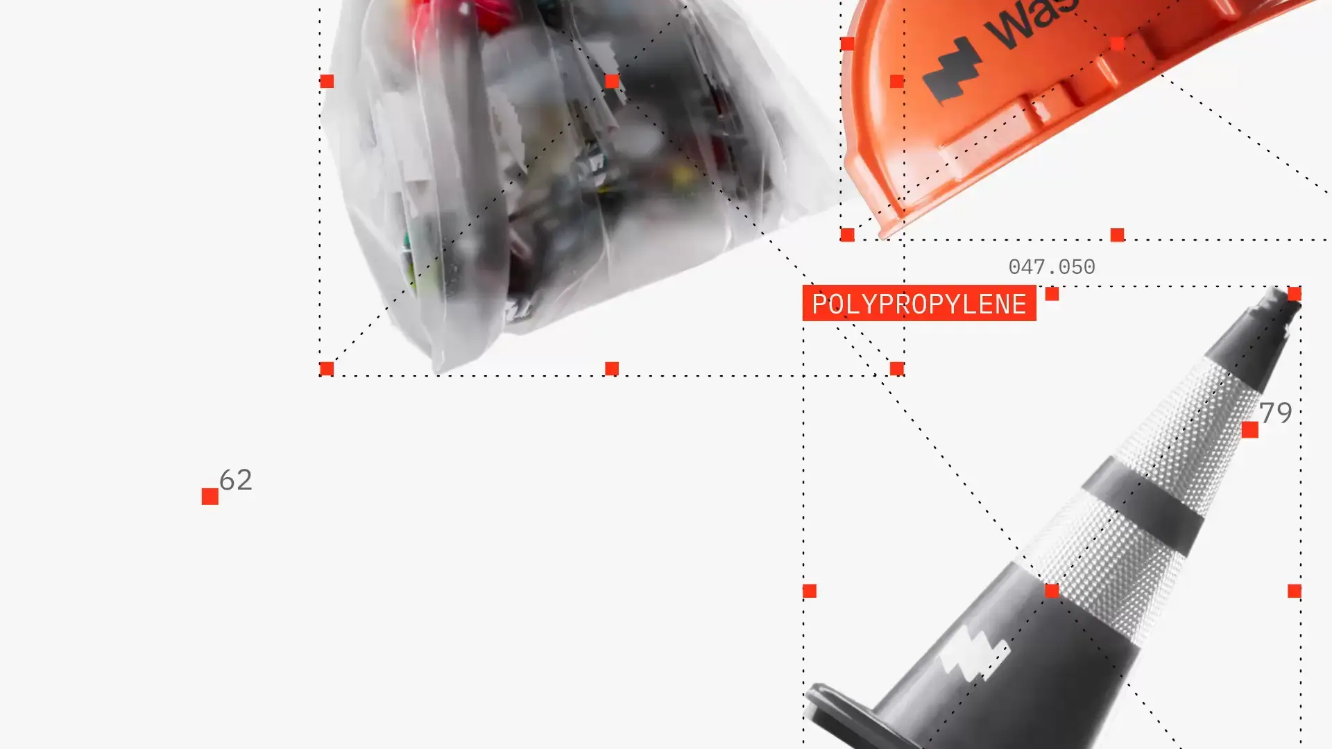
The segmentation system draws inspiration from paper-cut techniques. By slicing and revealing different layers, it reflects the analytical process used to understand waste composition and uncover its potential. Together, these principles form a visual language centered on exploration, understanding and value creation.
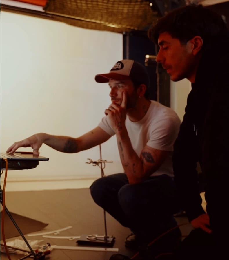
Team behind the project
Creative direction
Lou Bontemps
Global direction
Rémy Godet
Project management
Valentin Salmon
3D Design
Rémy Godet
UX/UI
Rémy Godet, Vincenzo Tilleul, Lou Bontemps
Motion Design
Rémy Godet, Bérengère Morel
Development
Andrea Tuysuzian, Alexandre Tuysuzian
Product Design
Valentin Salmon
Sound Design
Tanguy Drobniewski
Copy
Lou Bontemps
Production
Gurvann Touzé, Sébastien Marchand
Project Informations
The scope covered brand strategy, identity, motion design, UX/UI, product design, 3D, website, sound design, and development. A complete mission from concept to shipped experience.
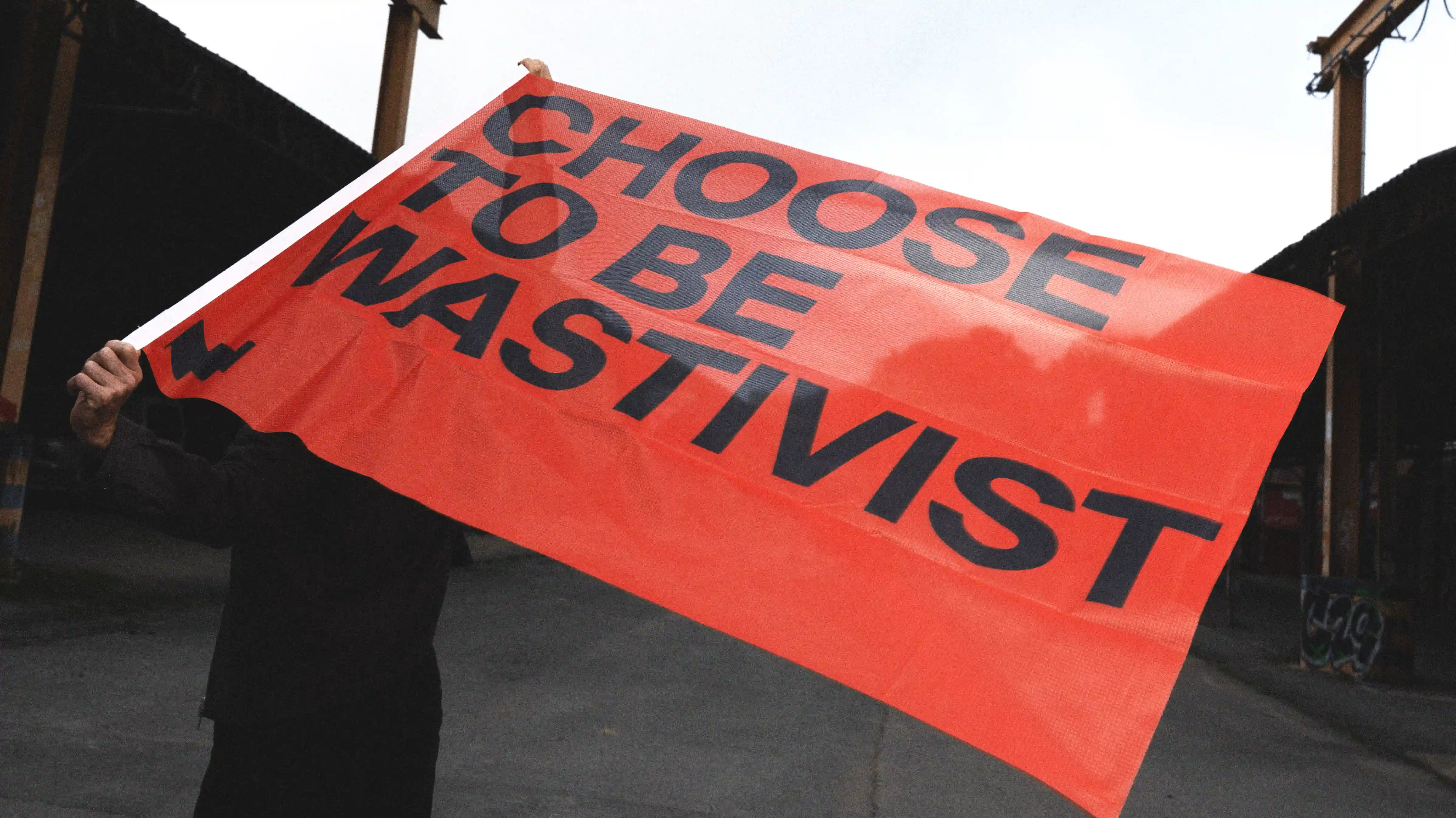
The brand sits deliberately outside conventional sustainability codes. No green messaging, no earnest climate narrative. The tone is industrial, performance-driven, and financial in register, built for procurement leads and CFOs who think in terms of material recovery and return on asset, not ESG communications teams. Wastetide's positioning is simple: waste is a hidden financial asset, and their technology makes it visible and tradeable.
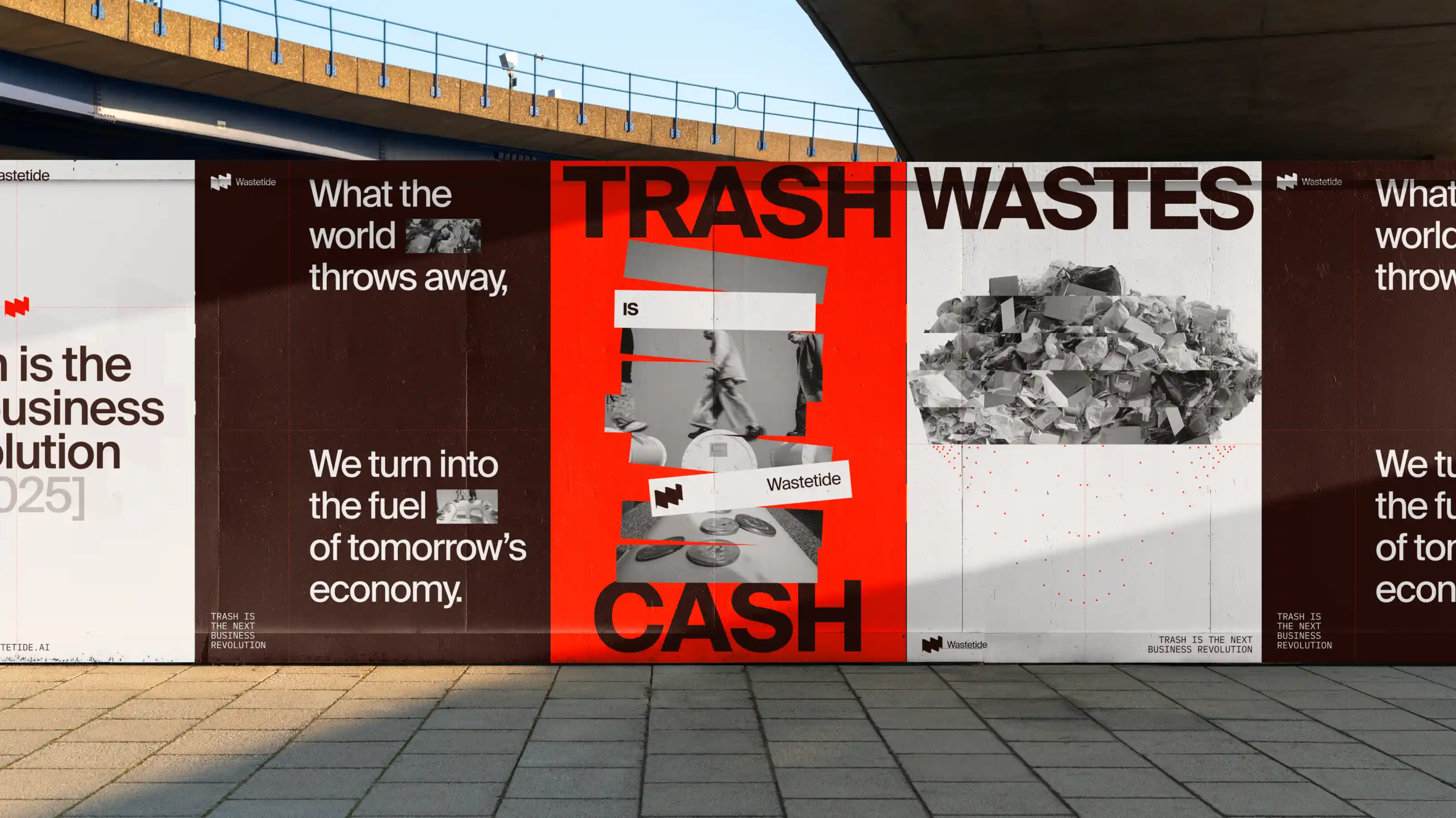
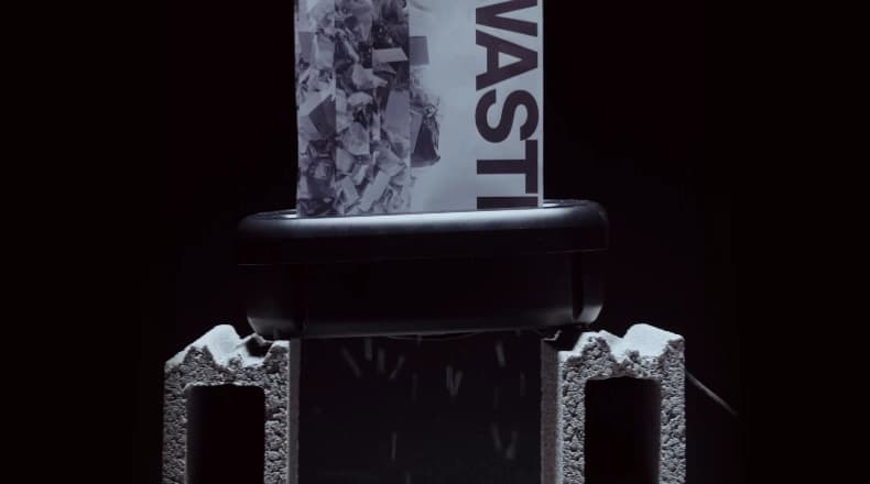
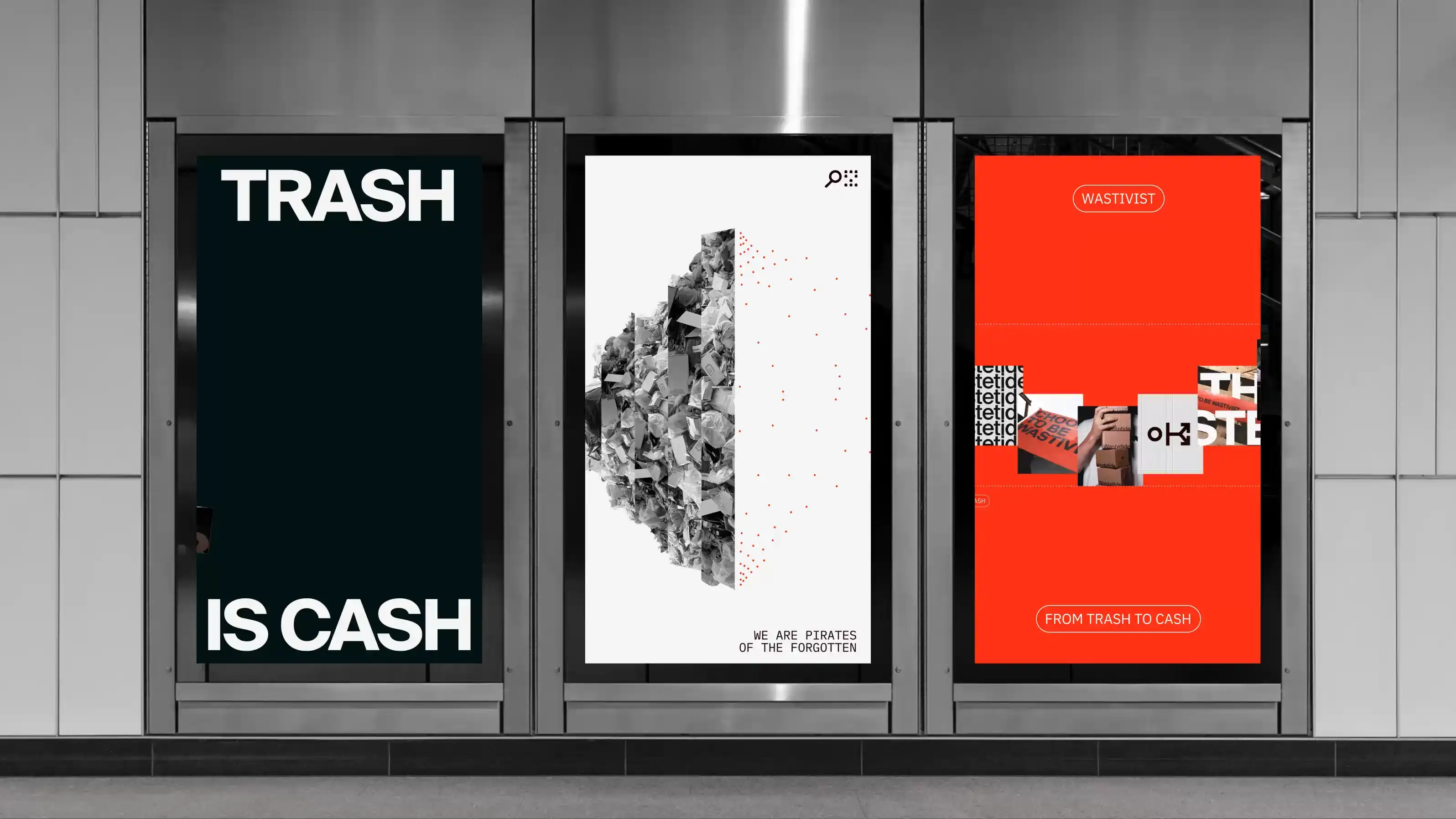
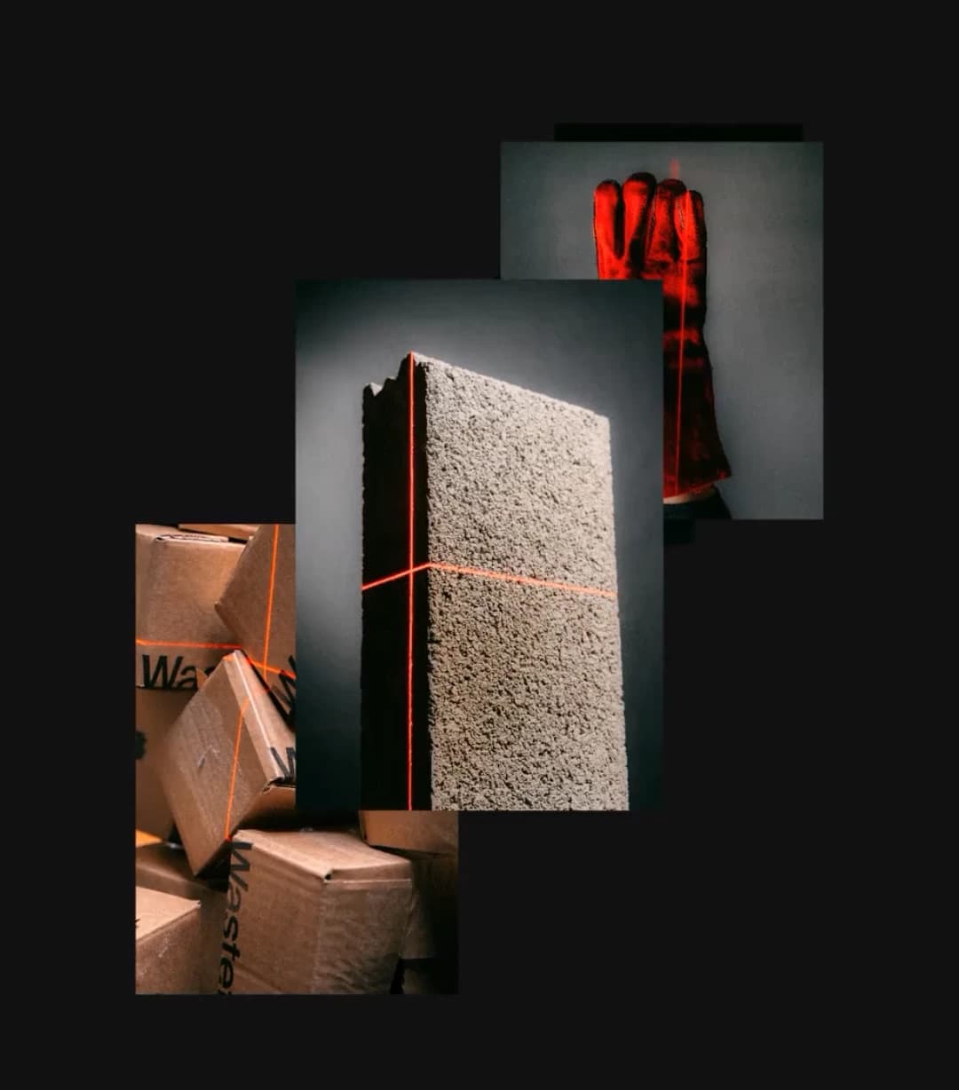
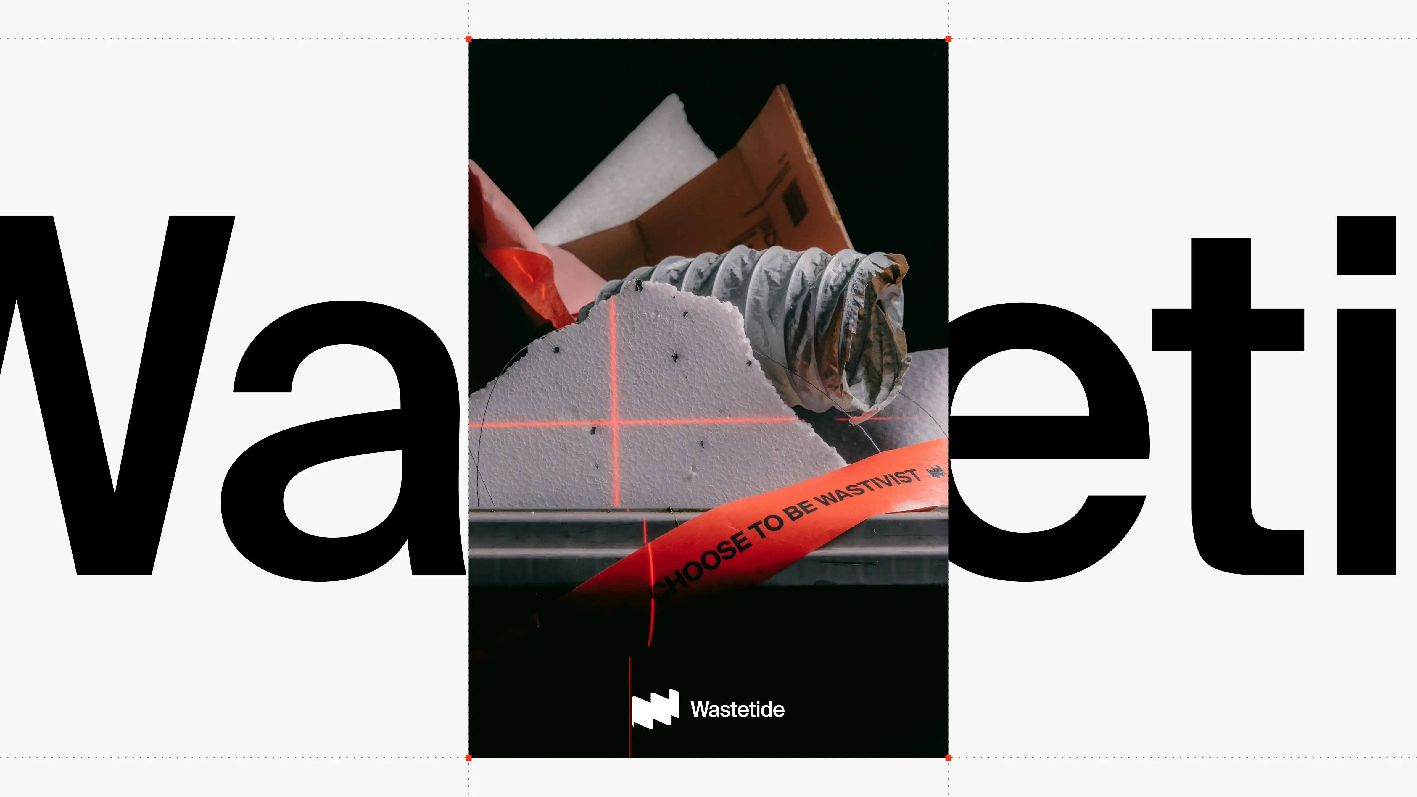
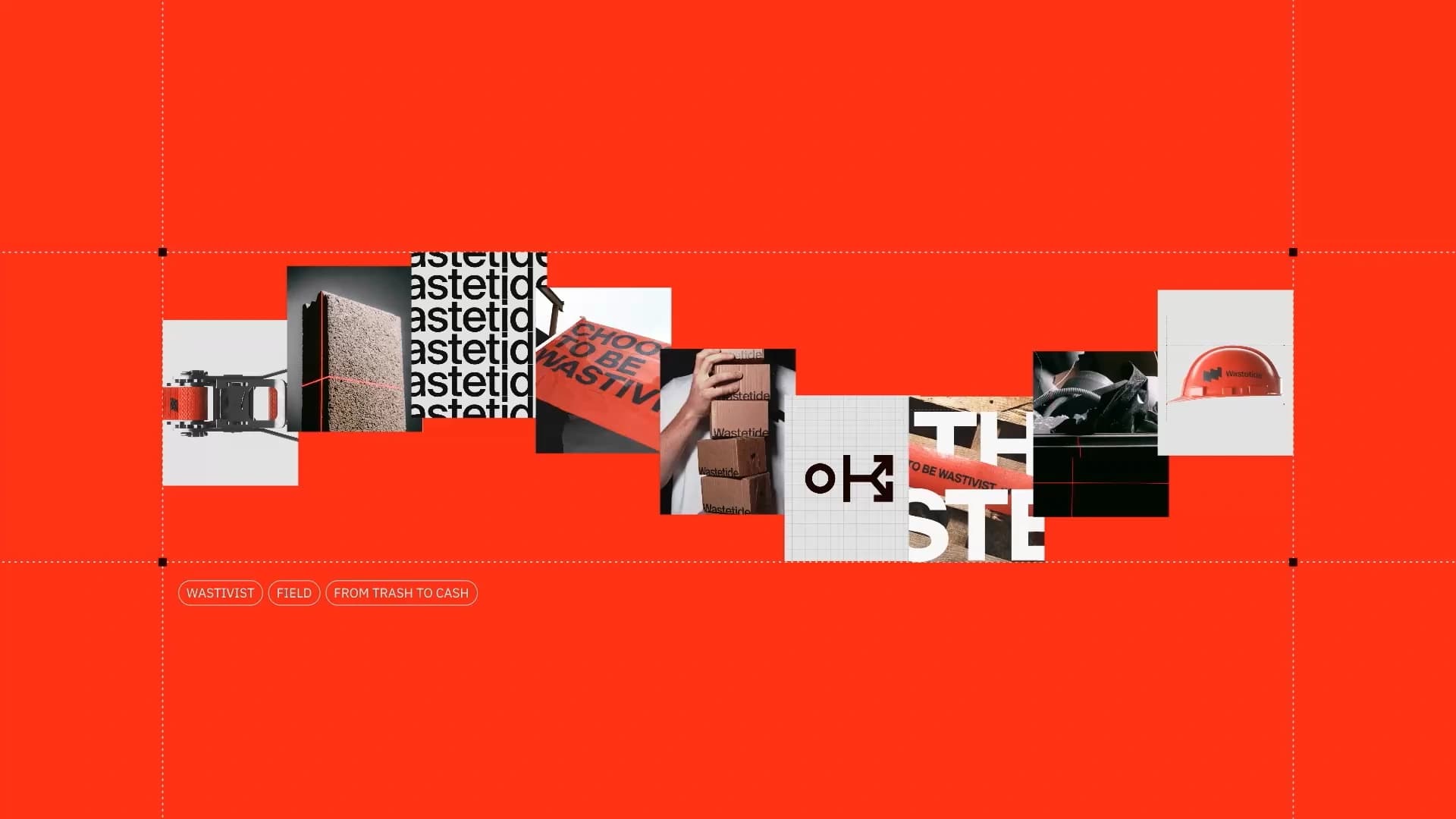
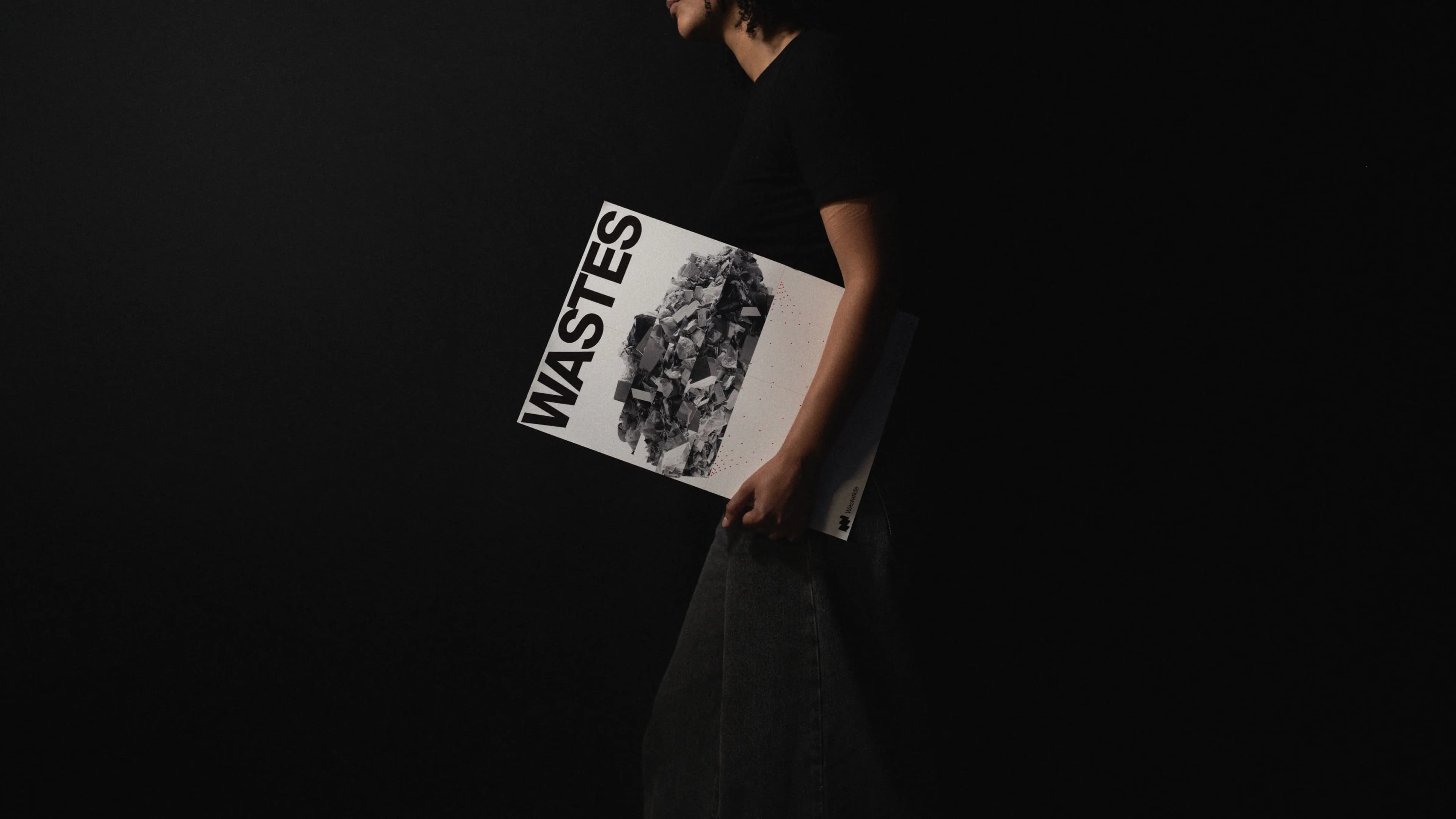
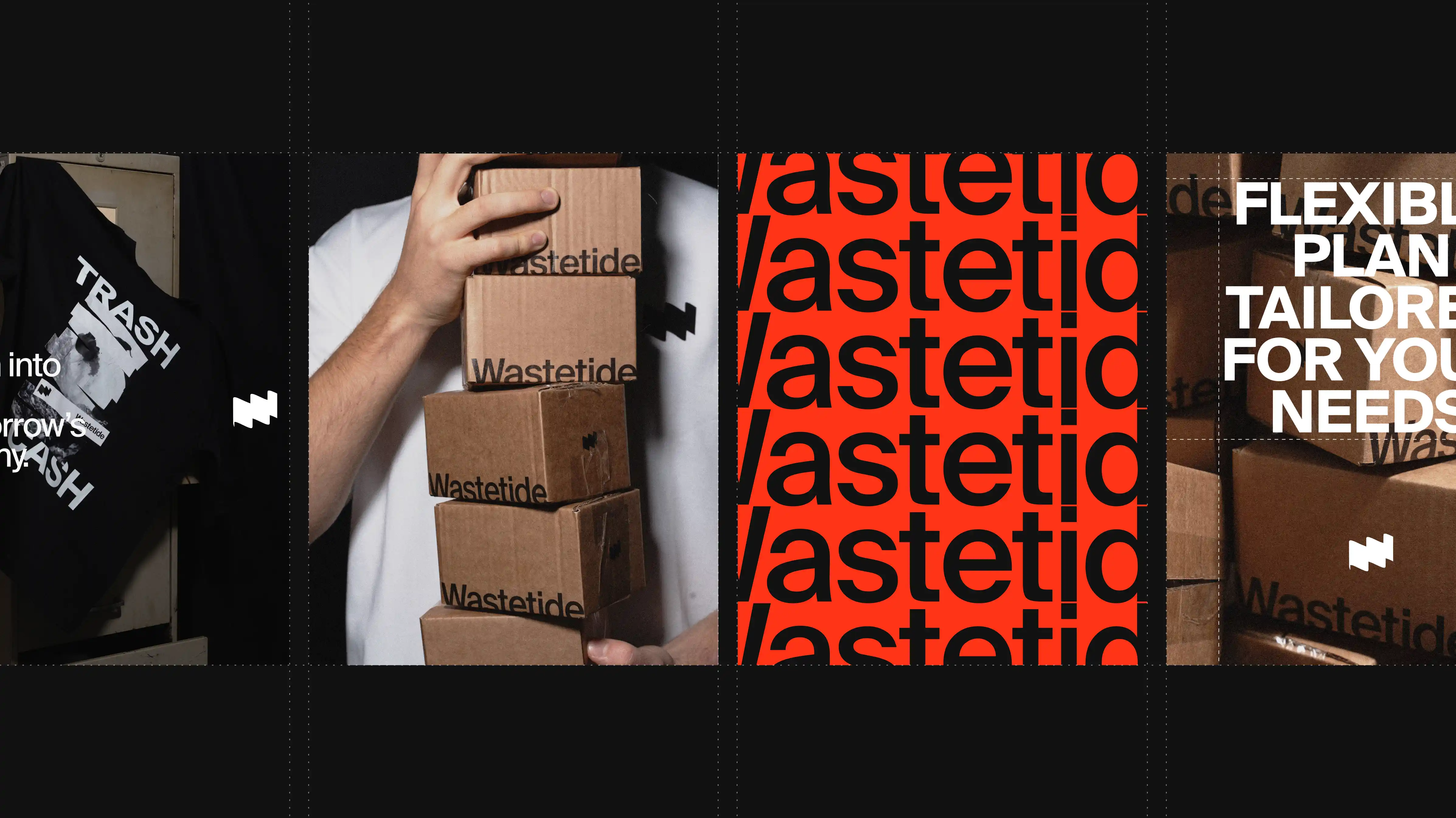
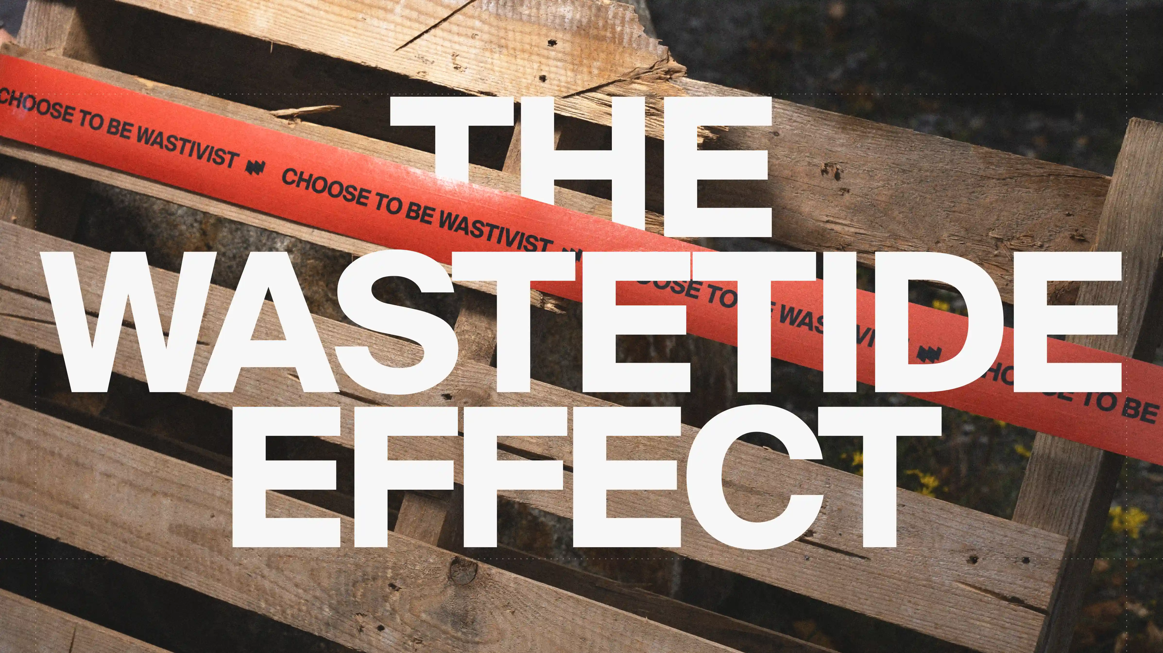
The visual system comes from a torn paper pattern pulled directly from shredded industrial waste. It's a texture that becomes a working tool, flexible enough to frame photography, drive typographic composition, and generate motion, while anchoring every touchpoint in the same core idea: value already exists beneath the surface, it just needs to be uncovered.
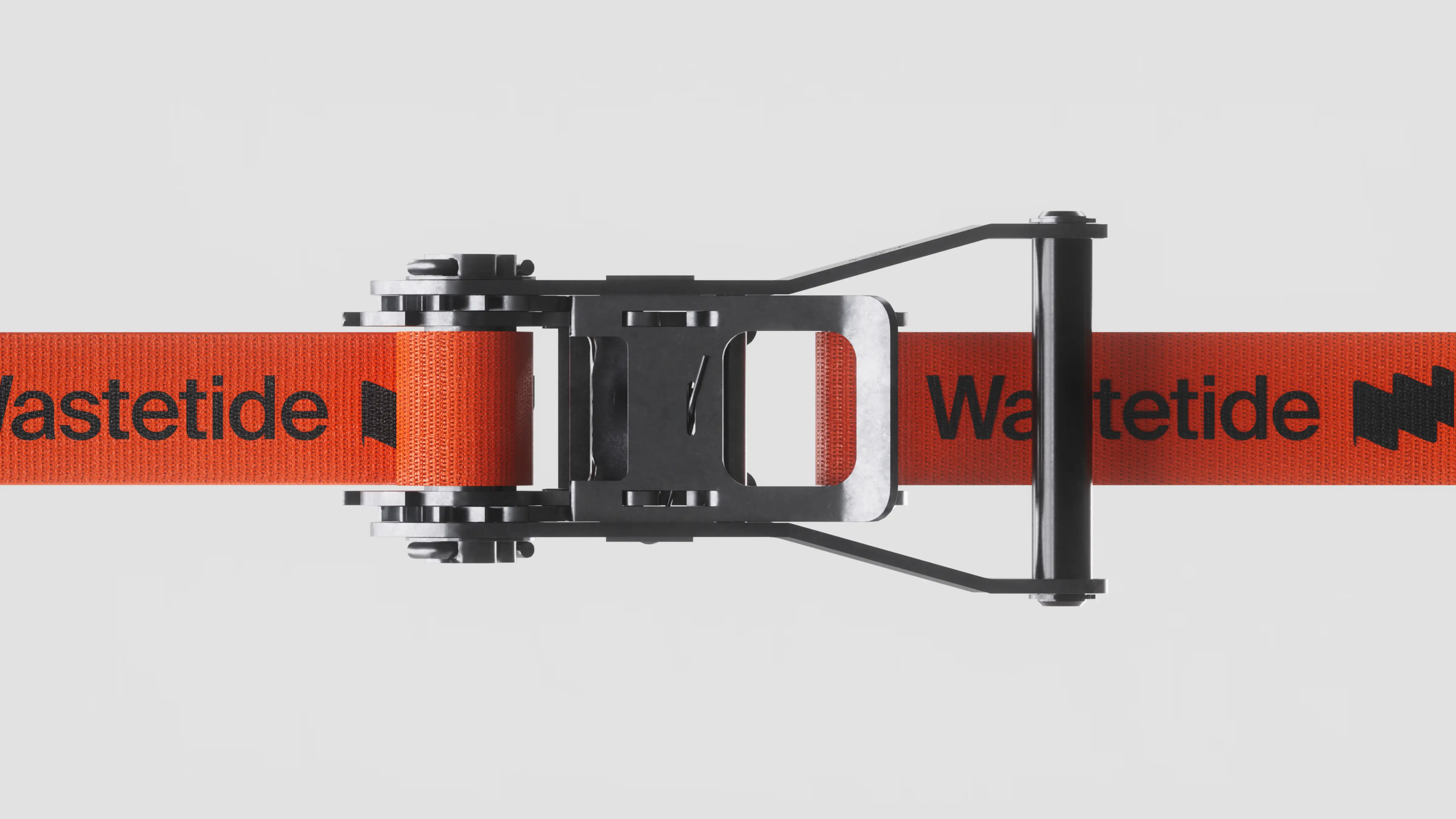
The logo carries three meanings compressed into one mark. The flag signals identification, the ability to locate opportunity. The wave references the continuous flow of materials across industrial cycles. The ascending line marks value creation over time. Combined with the “W”, these elements form a visual equation that describes what Wastetide actually does: detect, transform, extract value from overlooked waste.
The iceberg, wave, and segmentation motifs extend this logic into the full identity system. Each is a visual metaphor for Wastetide's analytical process. Together, they make an invisible service immediately legible to decision-makers who have no patience for abstraction.
FAQ
A complete creative mission: brand strategy, identity, motion design, UX/UI, product design, 3D, sound design, website, and development, from the first strategic brief to the live digital experience.
Three elements converge in one mark. A flag for identification and discovery. A wave for the continuous flow of materials and transformation. An ascending line for value creation over time. Combined with the initial “W”, they form a visual equation describing exactly what Wastetide does.
Because Wastetide's buyers are industrial operators and financial decision-makers, not sustainability teams. The brief was to position waste as a financial asset, not a cause. The identity is bold, direct, and performance-driven, closer to a fintech or data platform in register than to a cleantech startup.
The structural motif of the entire visual system, inspired directly by shredded industrial waste. It frames photography, drives typographic composition, and generates motion. A single visual principle that connects every touchpoint to the same idea: hidden value just beneath the surface.
Feel like working together?
So, let's shake the market! In real life