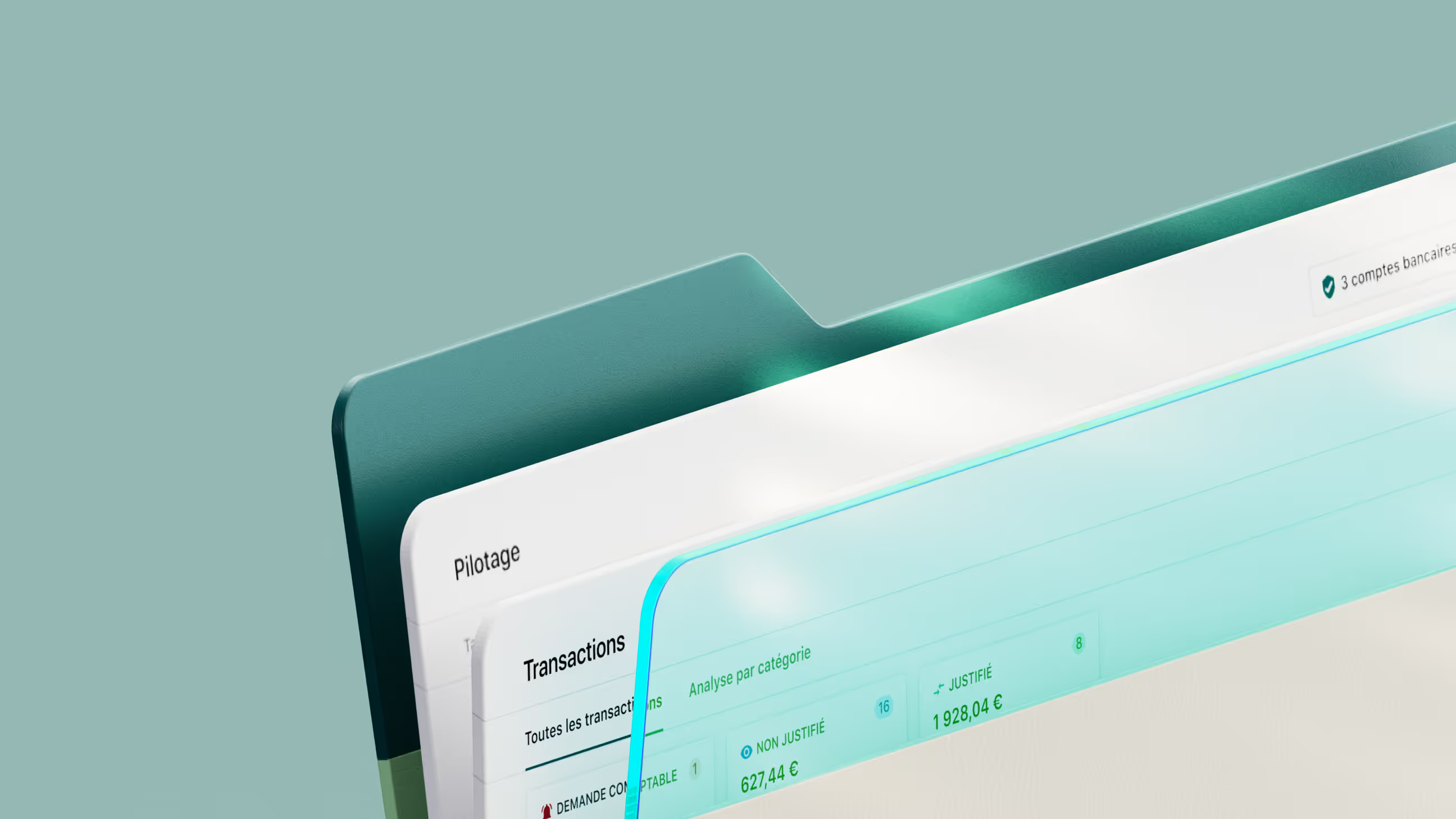
Tilt Branding: brand identity and website for the startup balancing the energy grid in real time
Logo
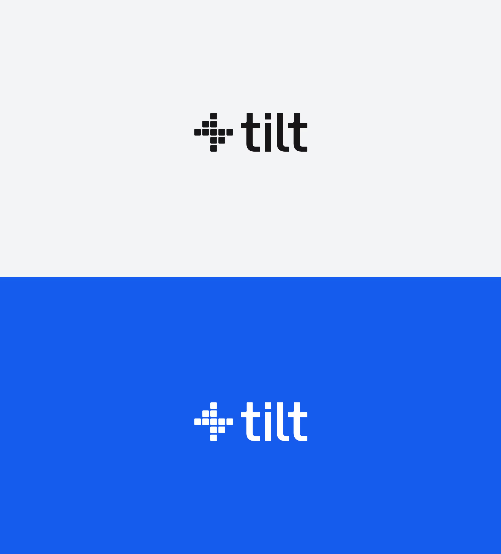
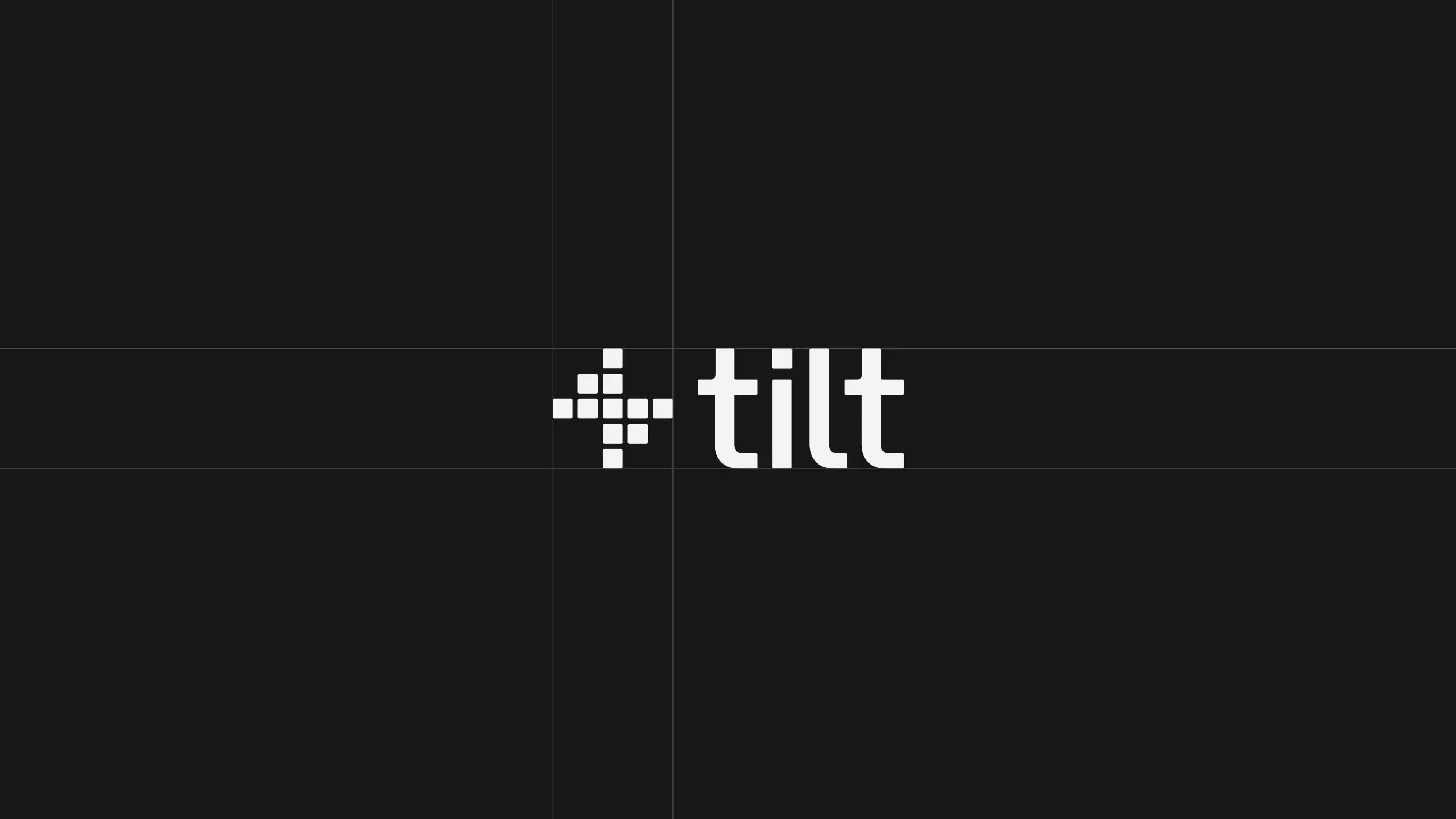
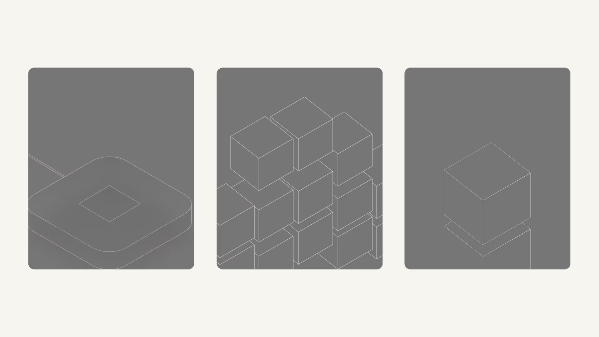
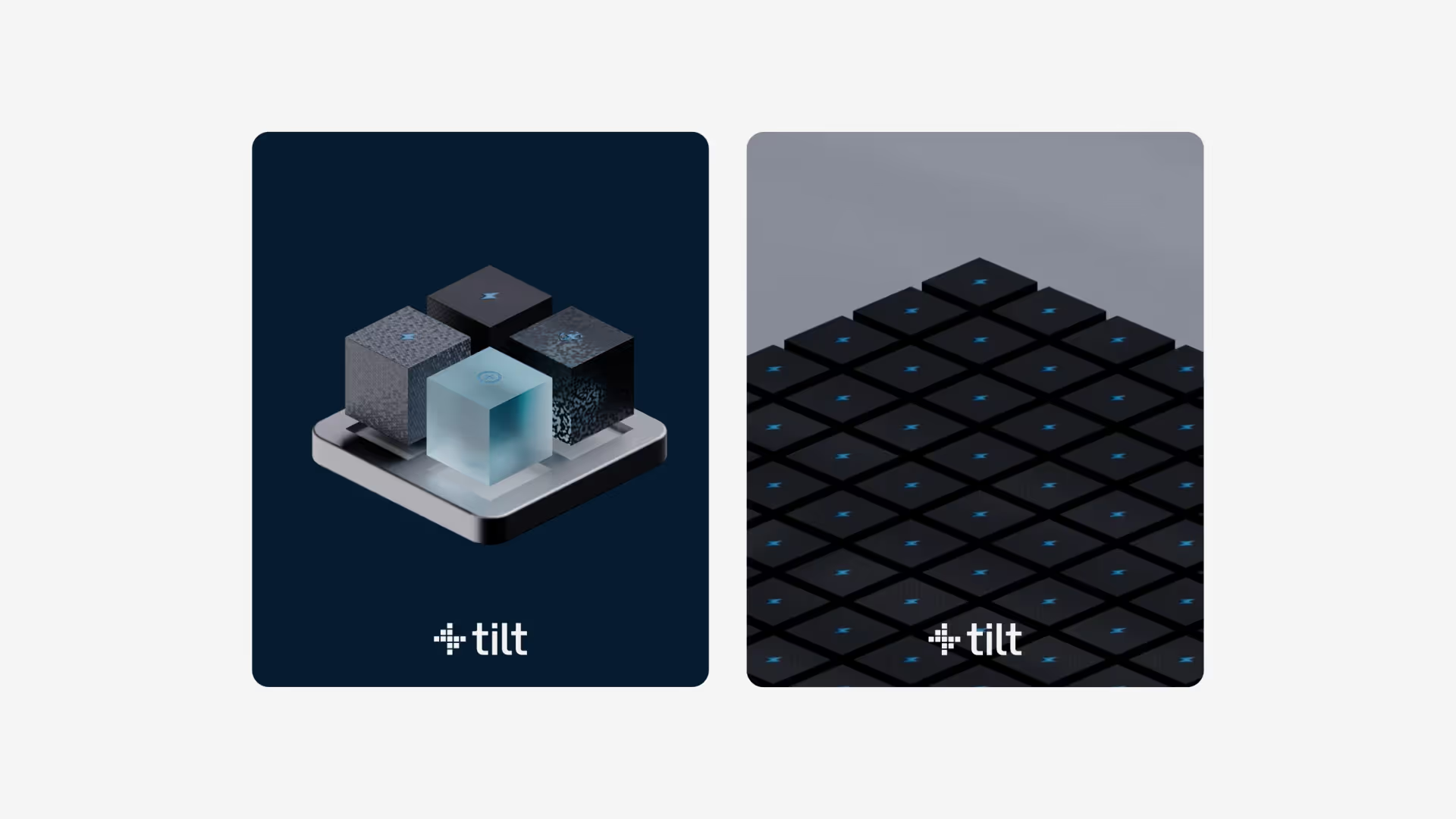
A Flexible Visual Identity The dotted and block pattern evokes an interconnected network, representing the management and optimization of electricity flows. The icon is designed as an evolving system: its structure allows it to adapt and be used across various applications and media.


Project Informations
Tilt is the startup orchestrating energy consumption to match available supply in real time, bringing balance, efficiency, and resilience to an increasingly complex grid. A deeptech player operating at the intersection of engineering and environmental impact.
anagram created the brand identity and website for Tilt with the goal of making an invisible, highly technical system immediately legible. The logo is conceived as an evolving system: its pattern of points and blocks evokes an interconnected network representing the management and optimization of energy flows.
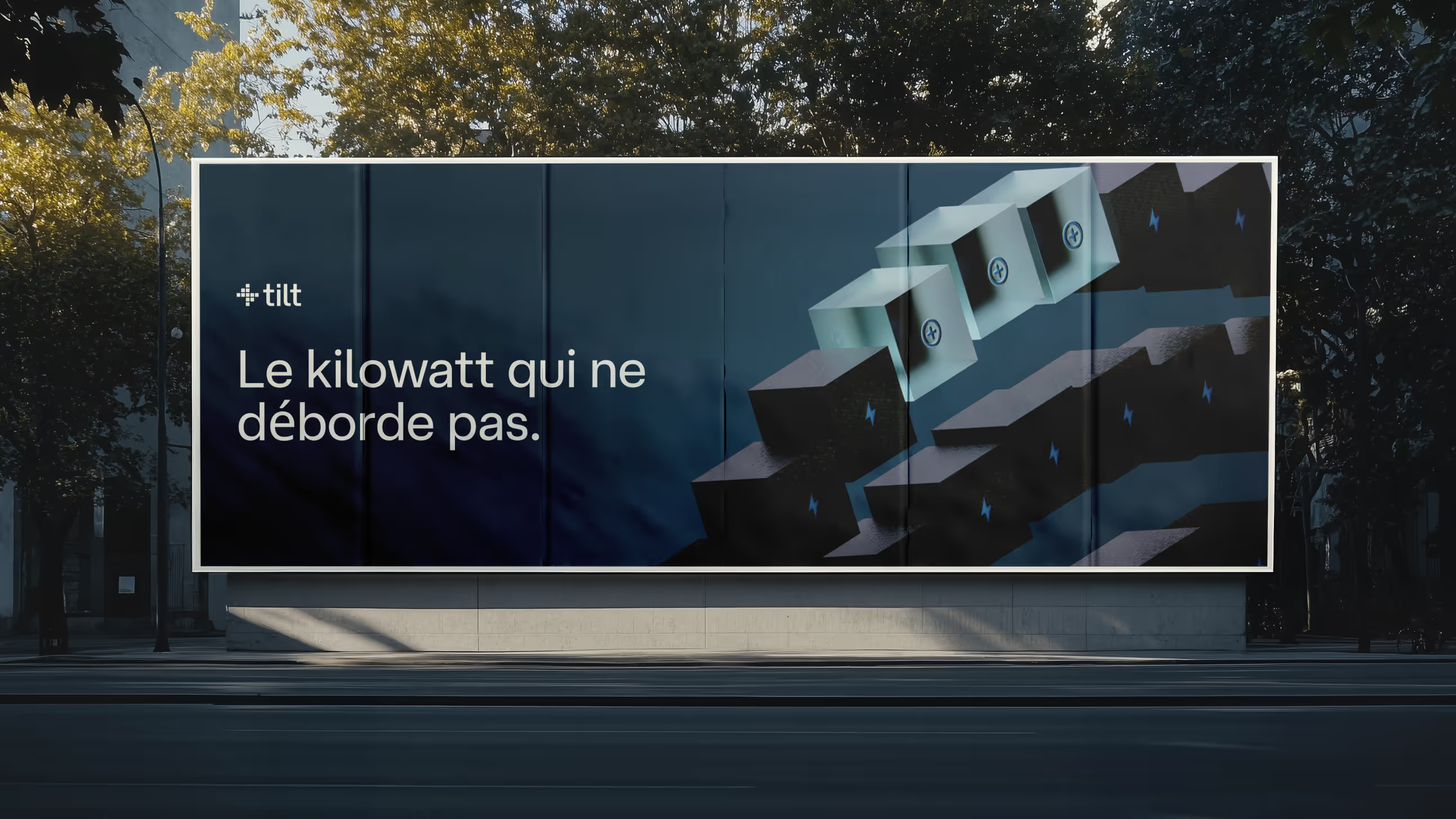
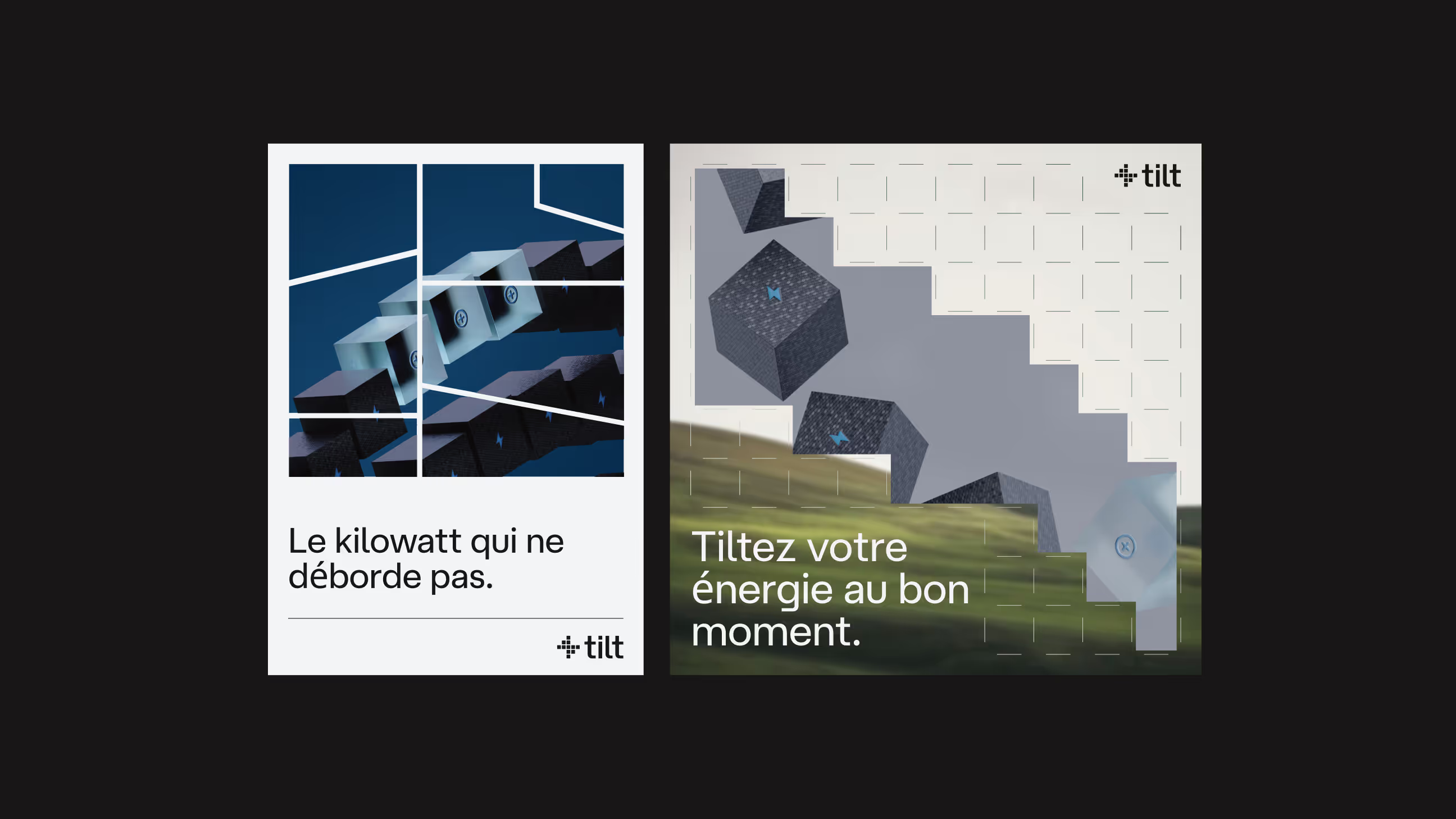
The visual identity is designed as a flexible system, structured to adapt and work across multiple applications and formats. A brand that embodies the idea of an intelligent, coherent, and constantly evolving energy network, precisely the technological promise Tilt delivers.
FAQ
A pattern of points and blocks forming an interconnected network, symbolizing the management and optimization of electrical flows. A flexible and scalable visual system, like Tilt's own technology.
Brand identity and website.
By anchoring the identity in the metaphor of the system, network, flow, interconnection, rather than generic green sector codes. For Tilt, this creates a distinctive, technical, and aspirational brand.
Feel like working together?
So, let's shake the market! In real life