Bee Branding: brand identity for the wearable AI assistant that understands you

Logo
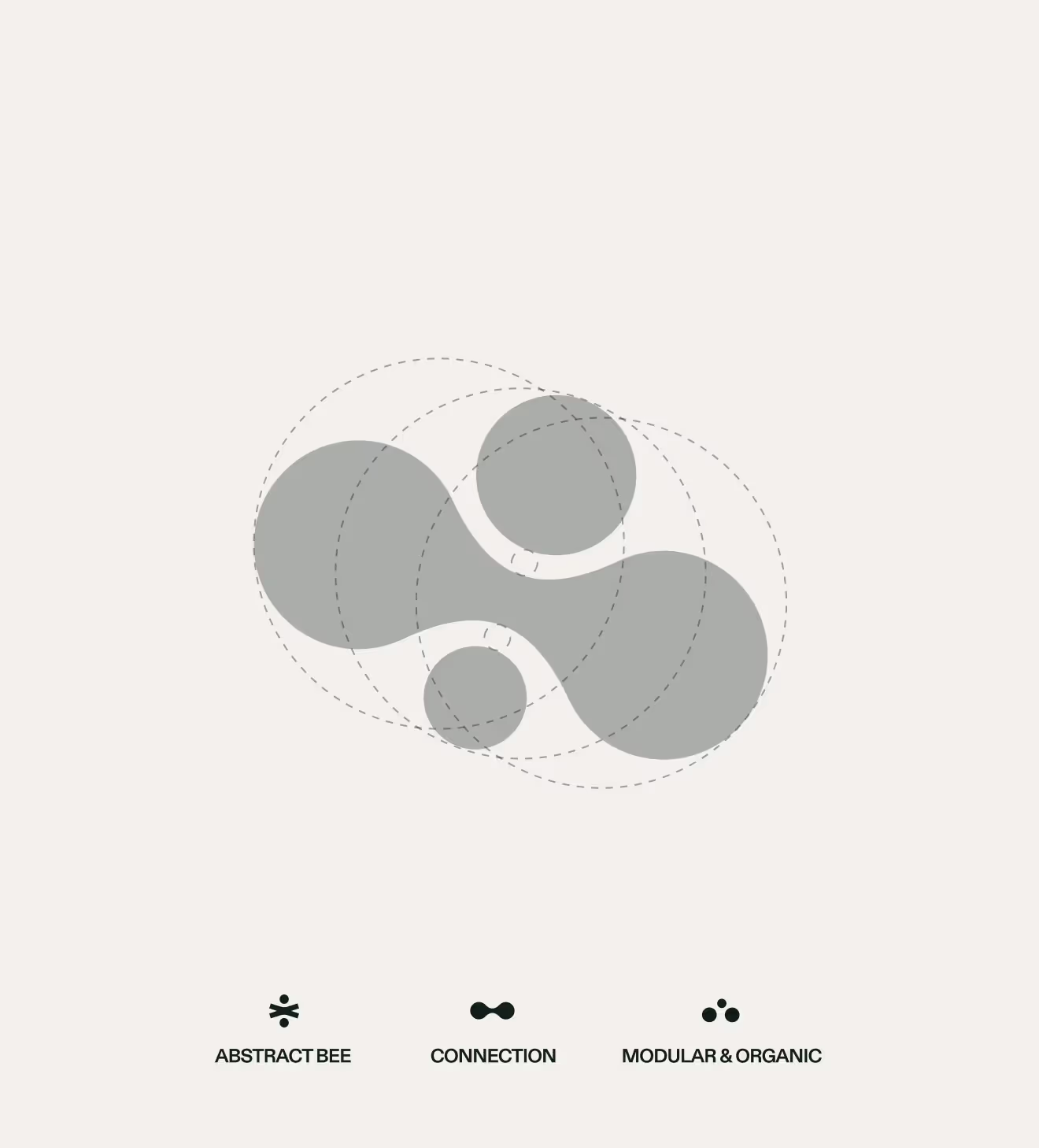
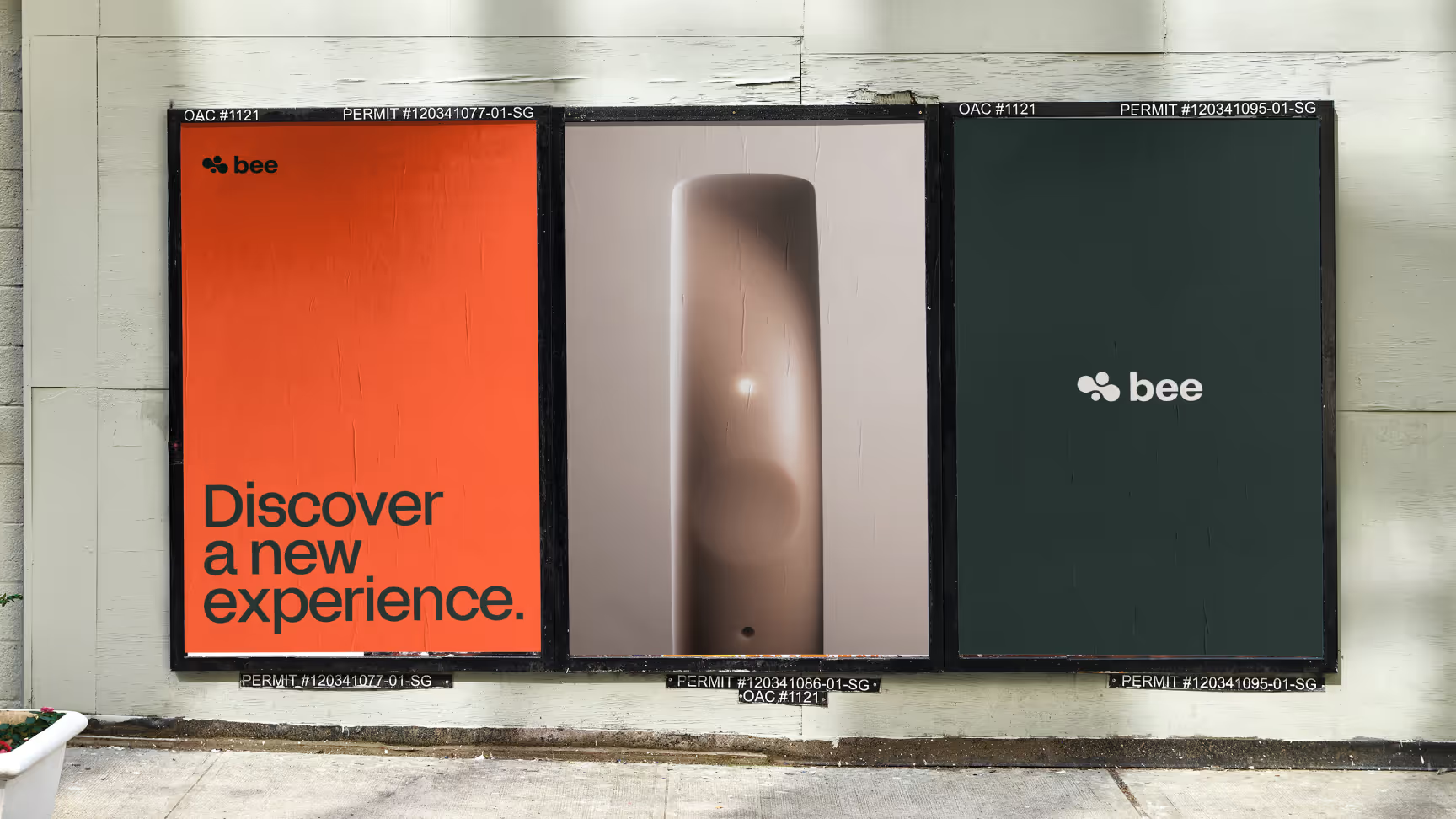
This logo represents a bee in an abstract manner. Its curves and graphic rendering evoke modularity, symbolizing Bee's ability to adapt to any user. The "wings" of the bee are organically connected to represent connectivity. The relatively smooth curves convey a sense of security and make the idea of using an AI device in everyday life more comforting. The icon is tilted 20% upwards to symbolize evolution.



Project Informations
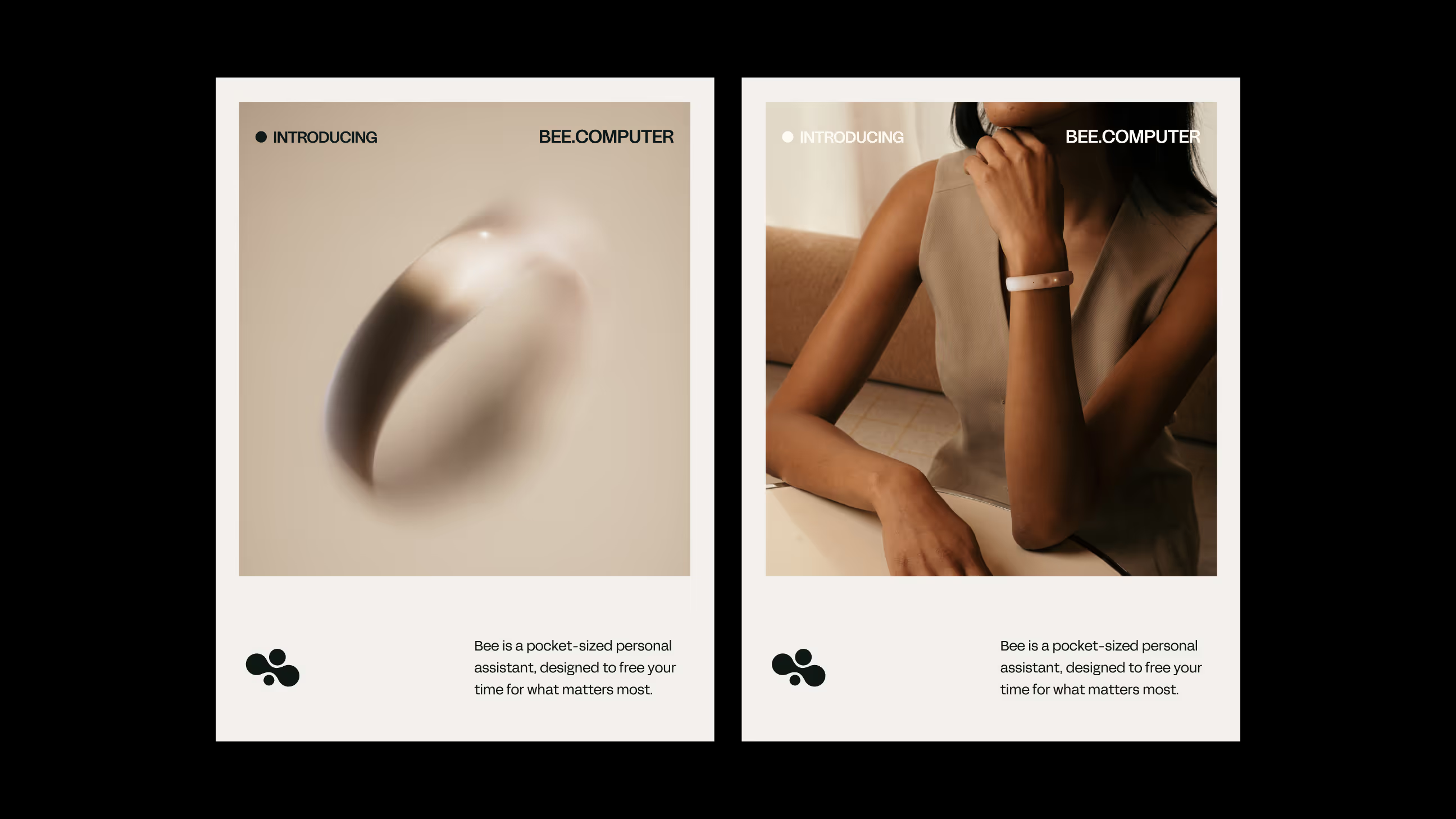
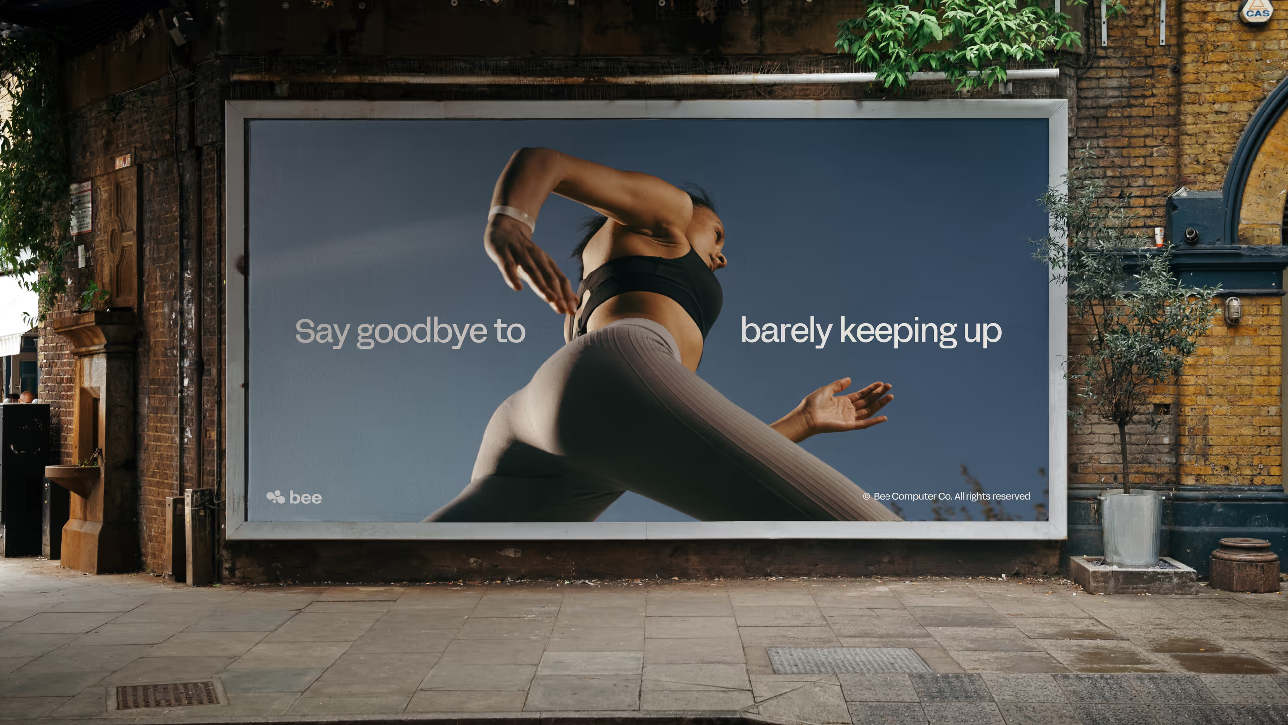
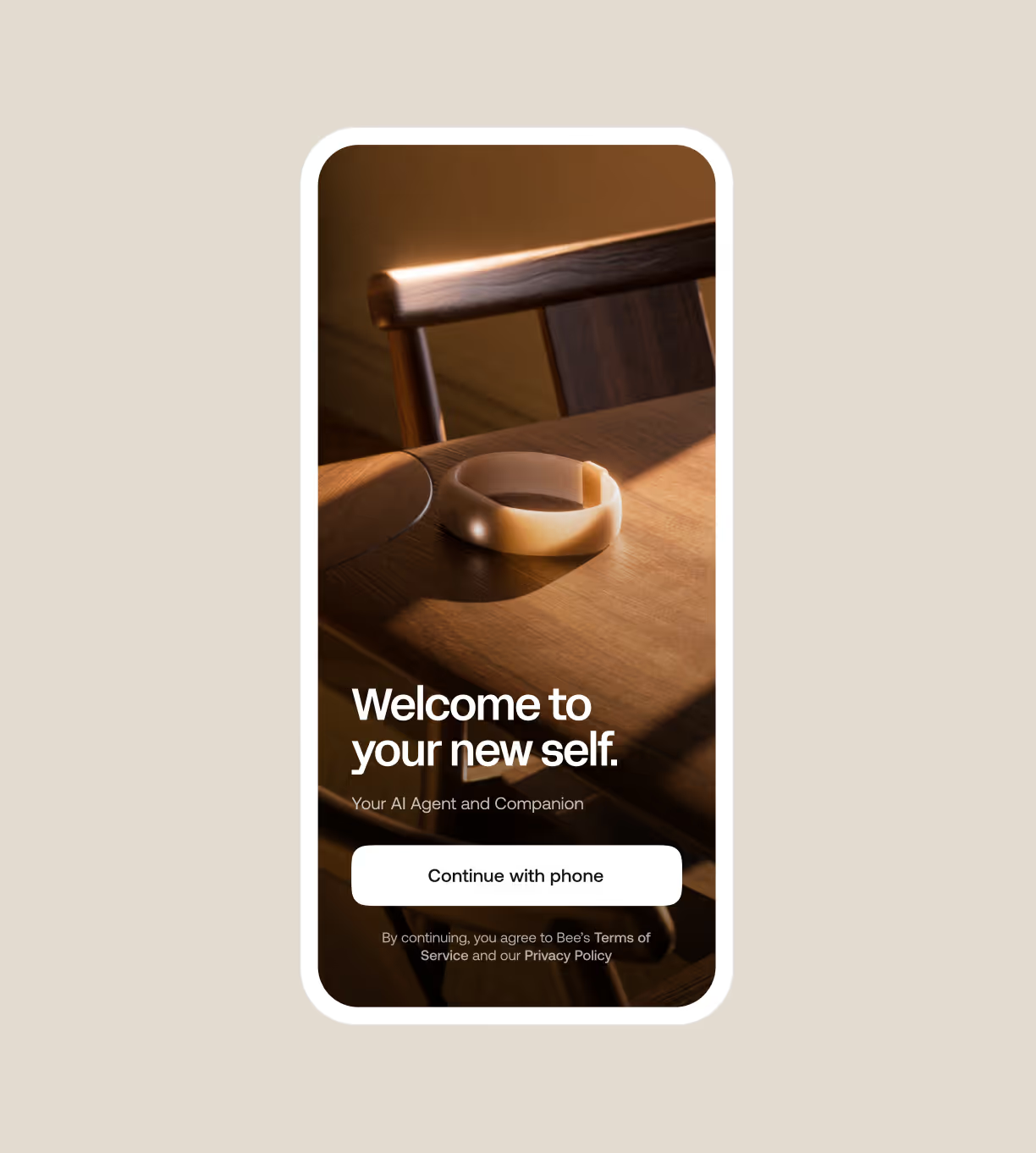
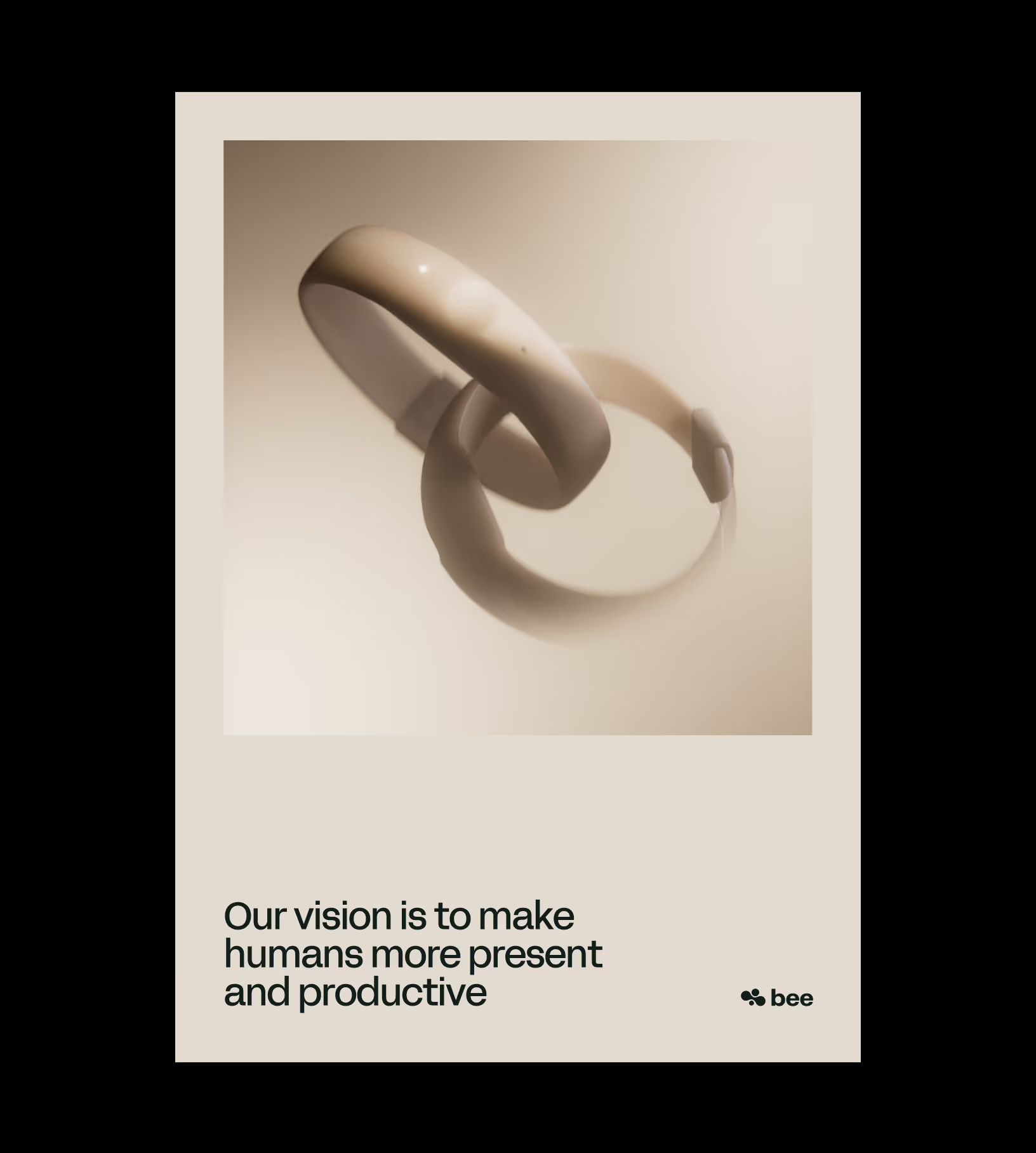
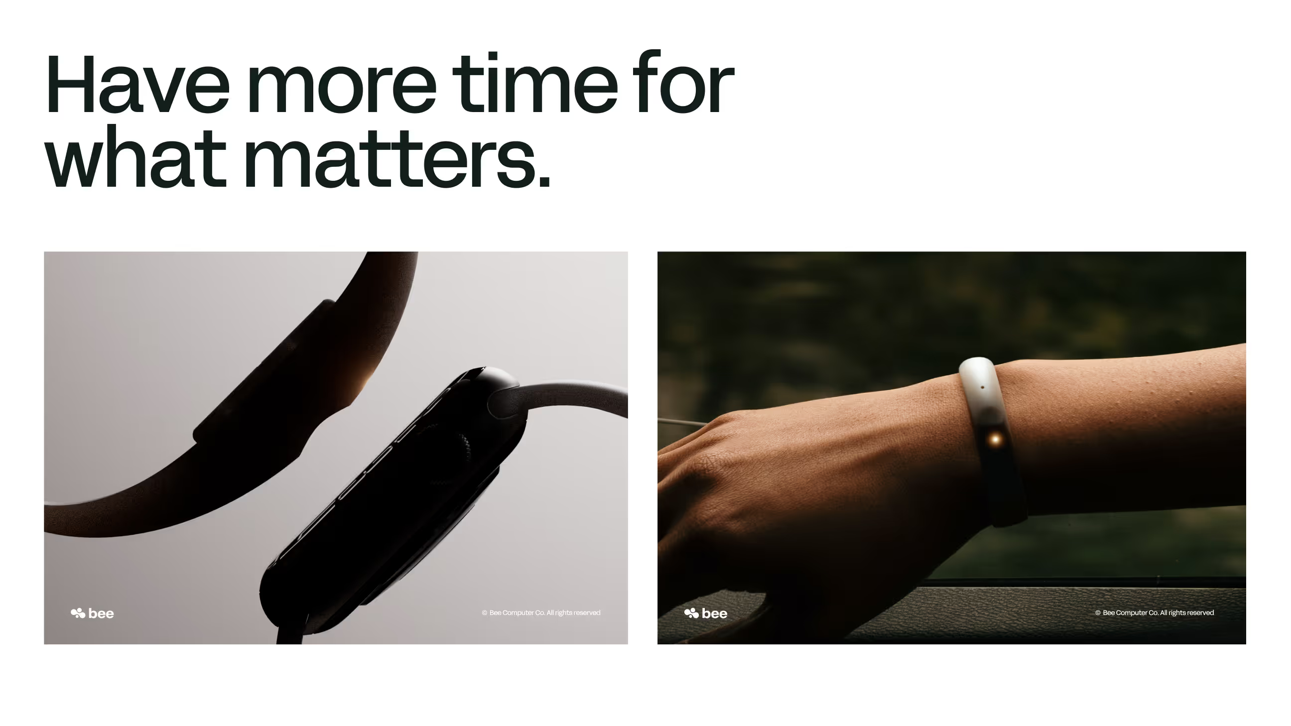
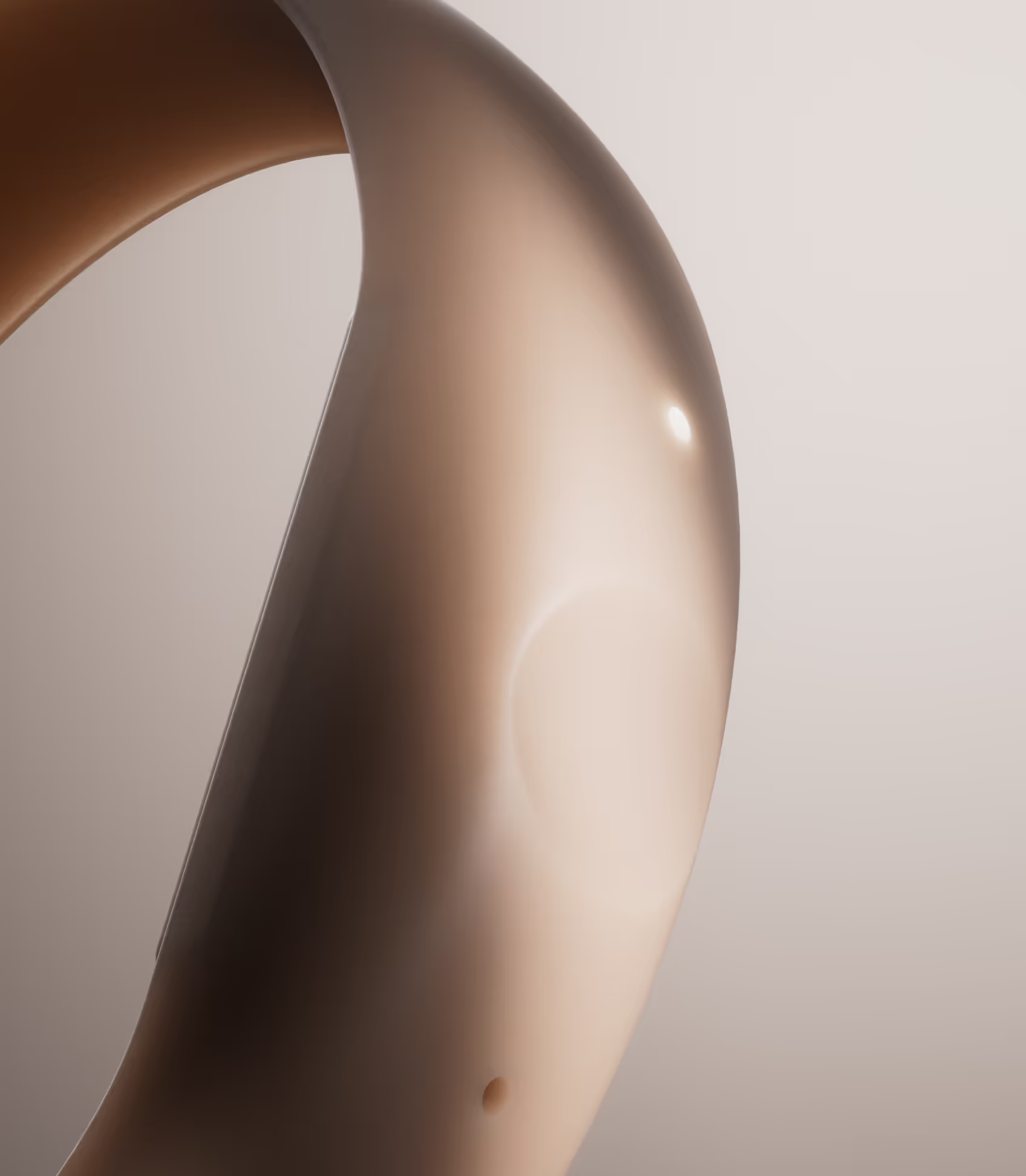
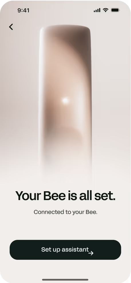
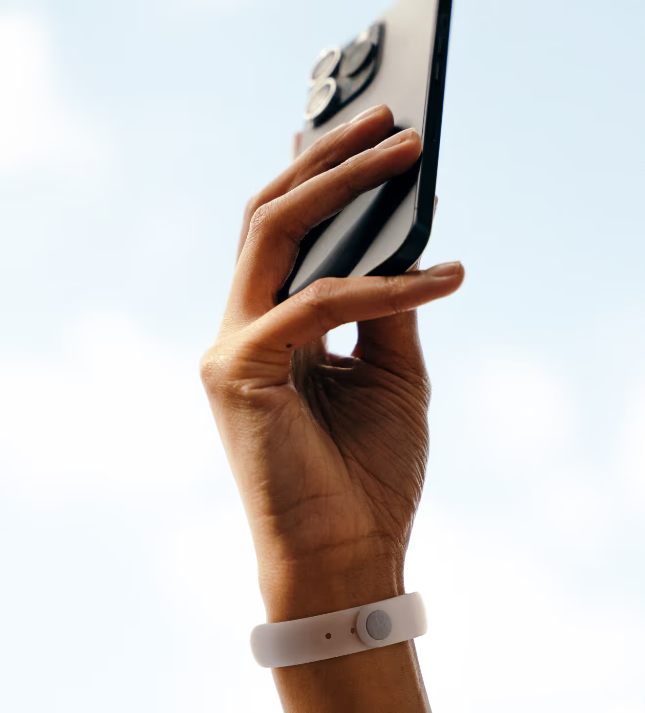
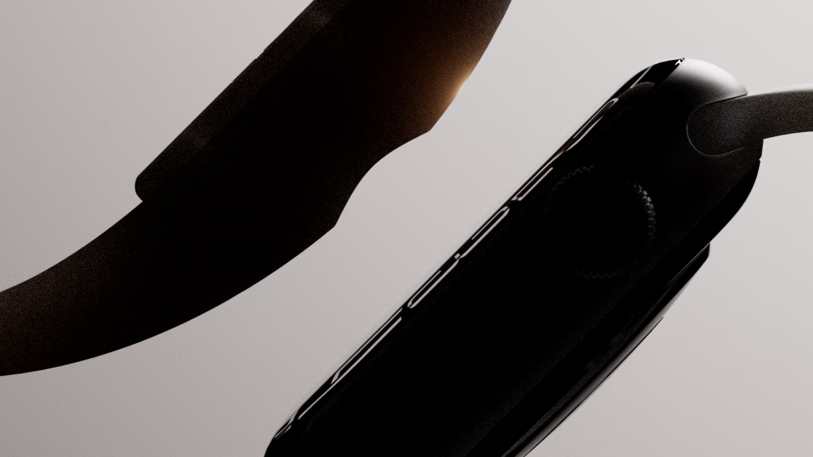
Bee is the wearable AI assistant designed to understand and adapt to each user. In a market flooded with software-based AI interfaces, Bee bets on hardware: a discreet, always-available physical device that learns from you over time. Bee was acquired by Amazon in 2025, marking its entry into the wearable AI space.
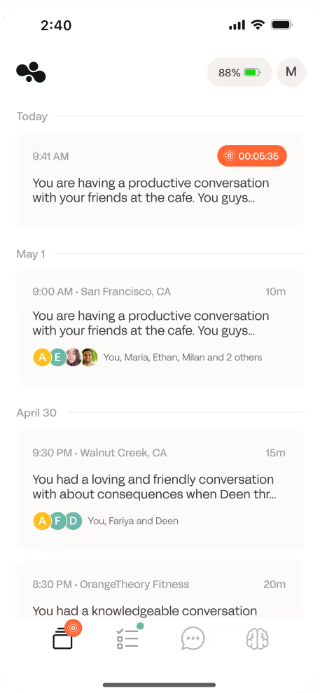
anagram created the logo, full brand identity, website, and photography direction for Bee. Every element of the logo carries intentional meaning. The organic curves evoke modularity and adaptability, the connected wings symbolize seamless connectivity, and the 20 degree upward tilt signals evolution and forward momentum.
The creative challenge was to make AI feel both desirable and reassuring as a physical everyday object. Not too technical, not too generic, a premium brand capable of owning a space that barely existed yet.
FAQ
Each element is intentional. The curves evoke modularity and adaptability, the connected wings symbolize connectivity, and the 20 degree upward tilt signals evolution and progress.
Logo, full brand identity, website, and photography direction.
By centering the identity on daily use and personal adaptation rather than the underlying technology, making AI feel tangible, comfortable, and emotionally desirable rather than intimidating.
Feel like working together?
So, let's shake the market! In real life