Perma Branding: brand identity and logo for the photo sharing application
Logo
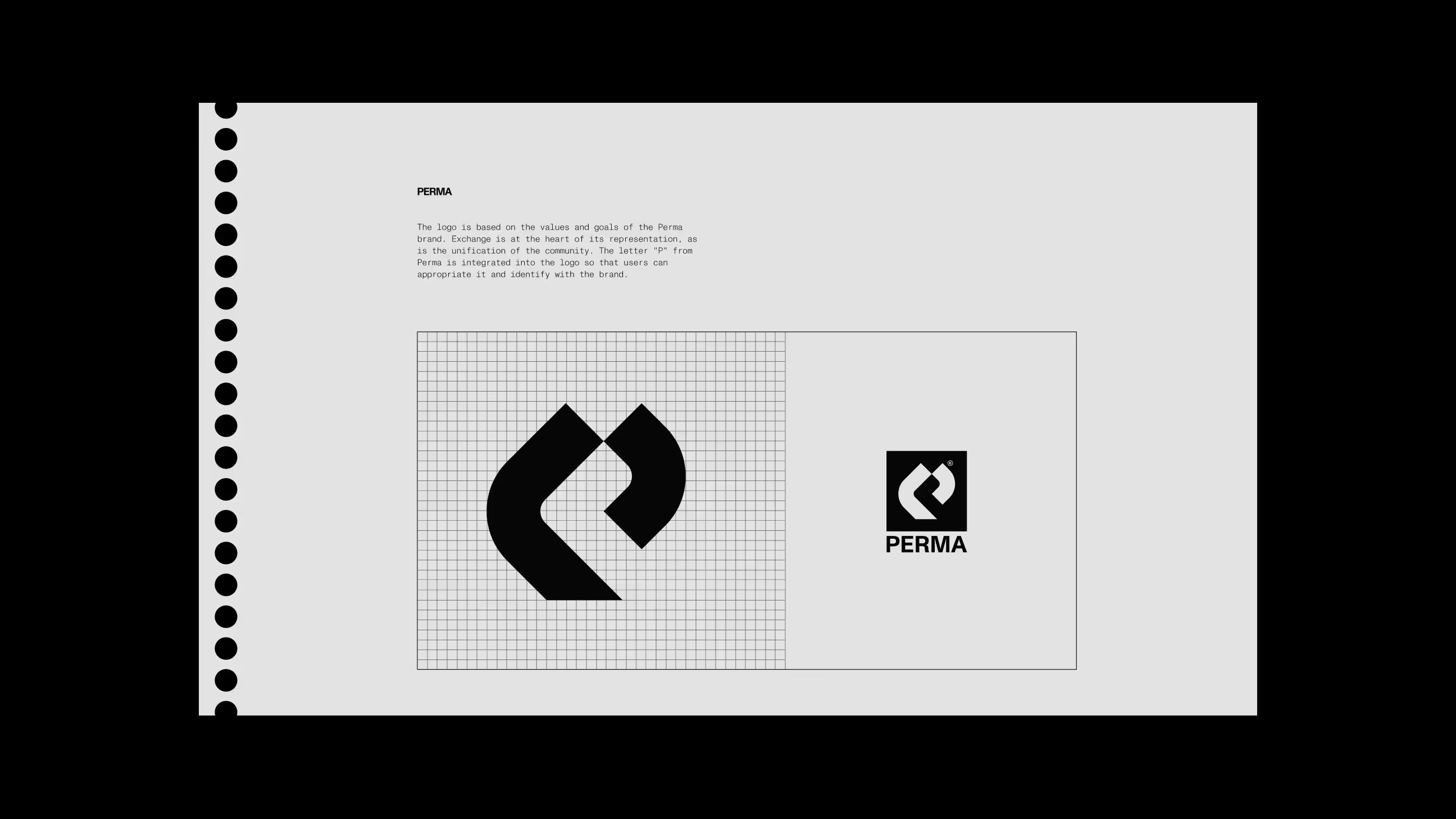
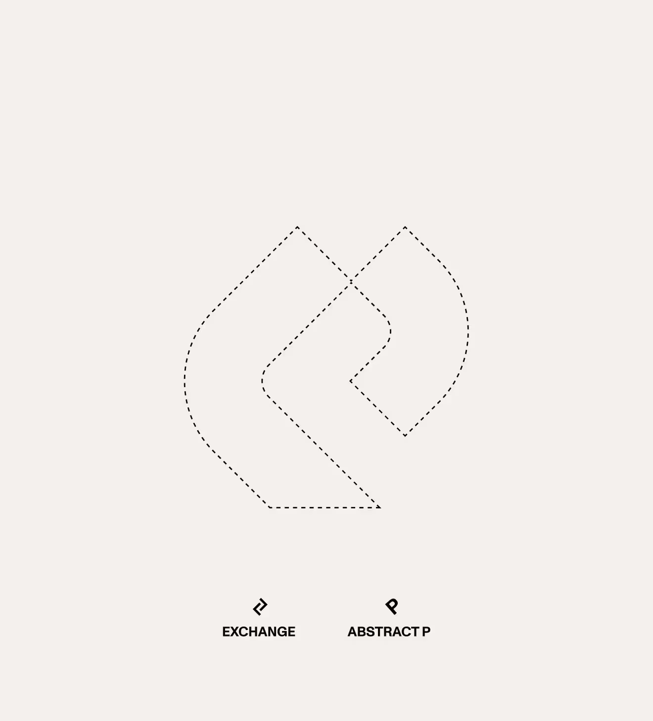
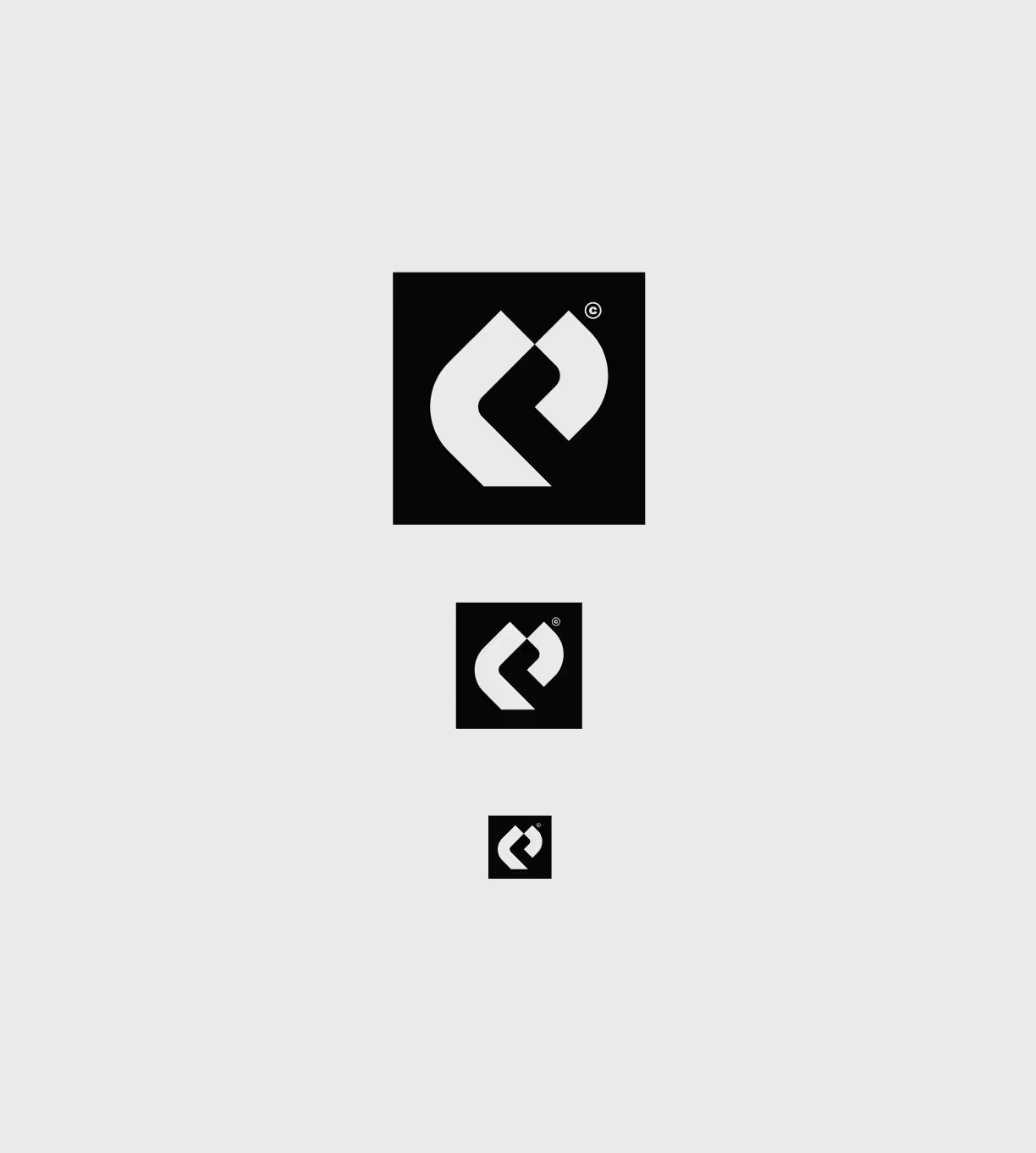
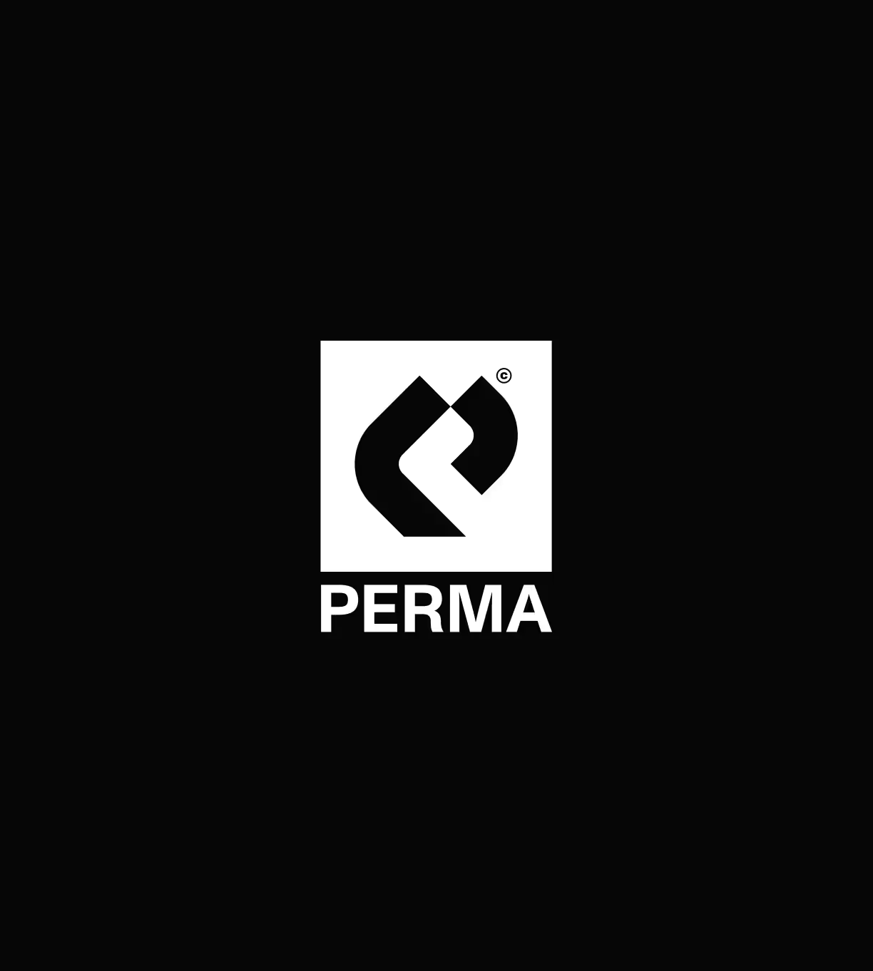
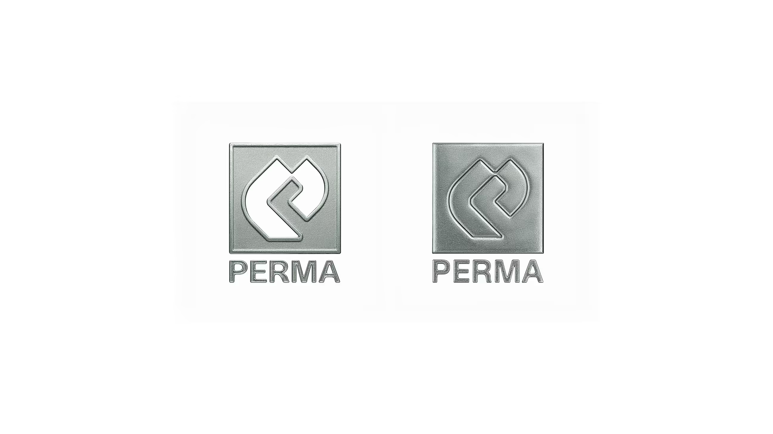
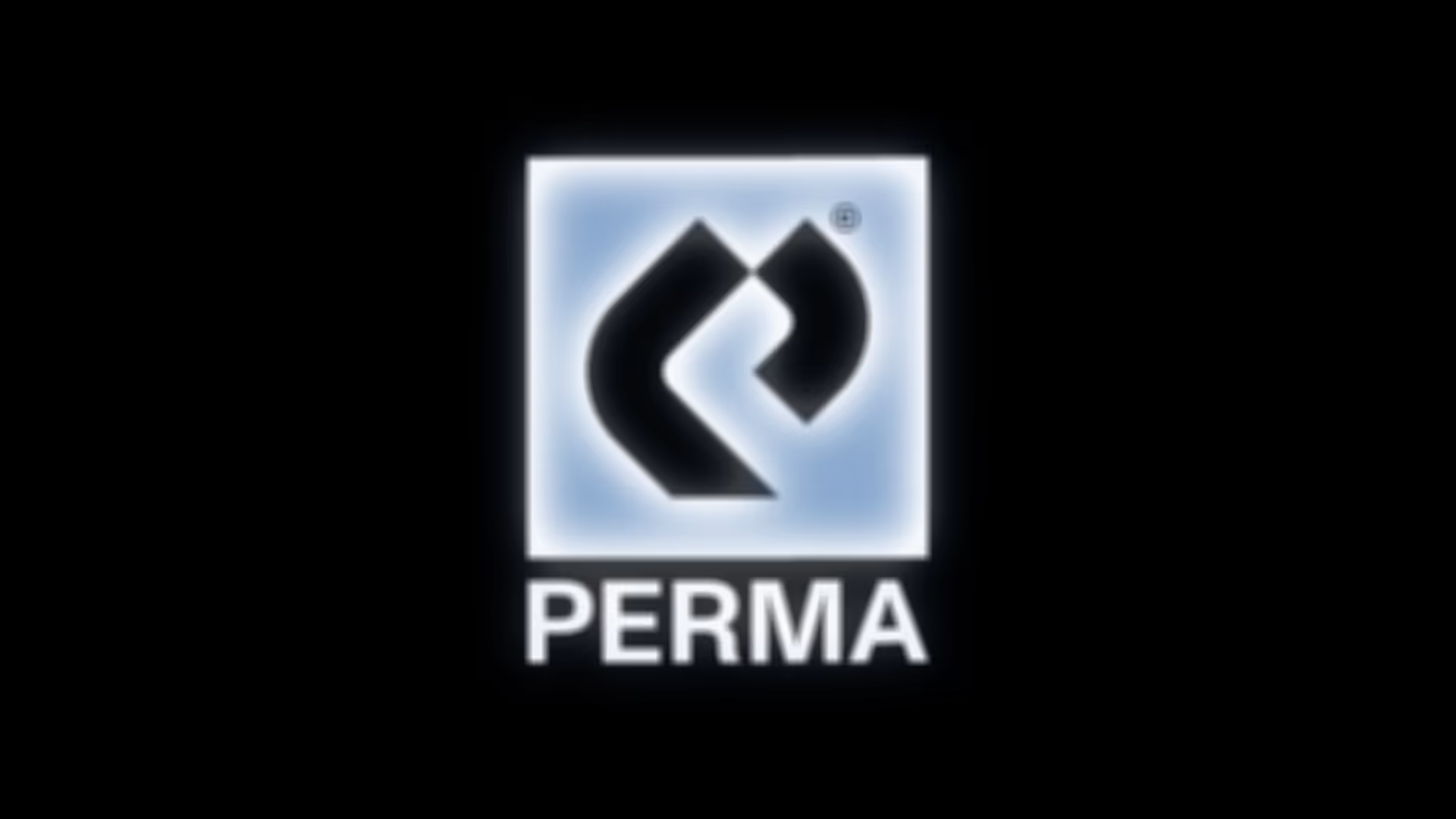
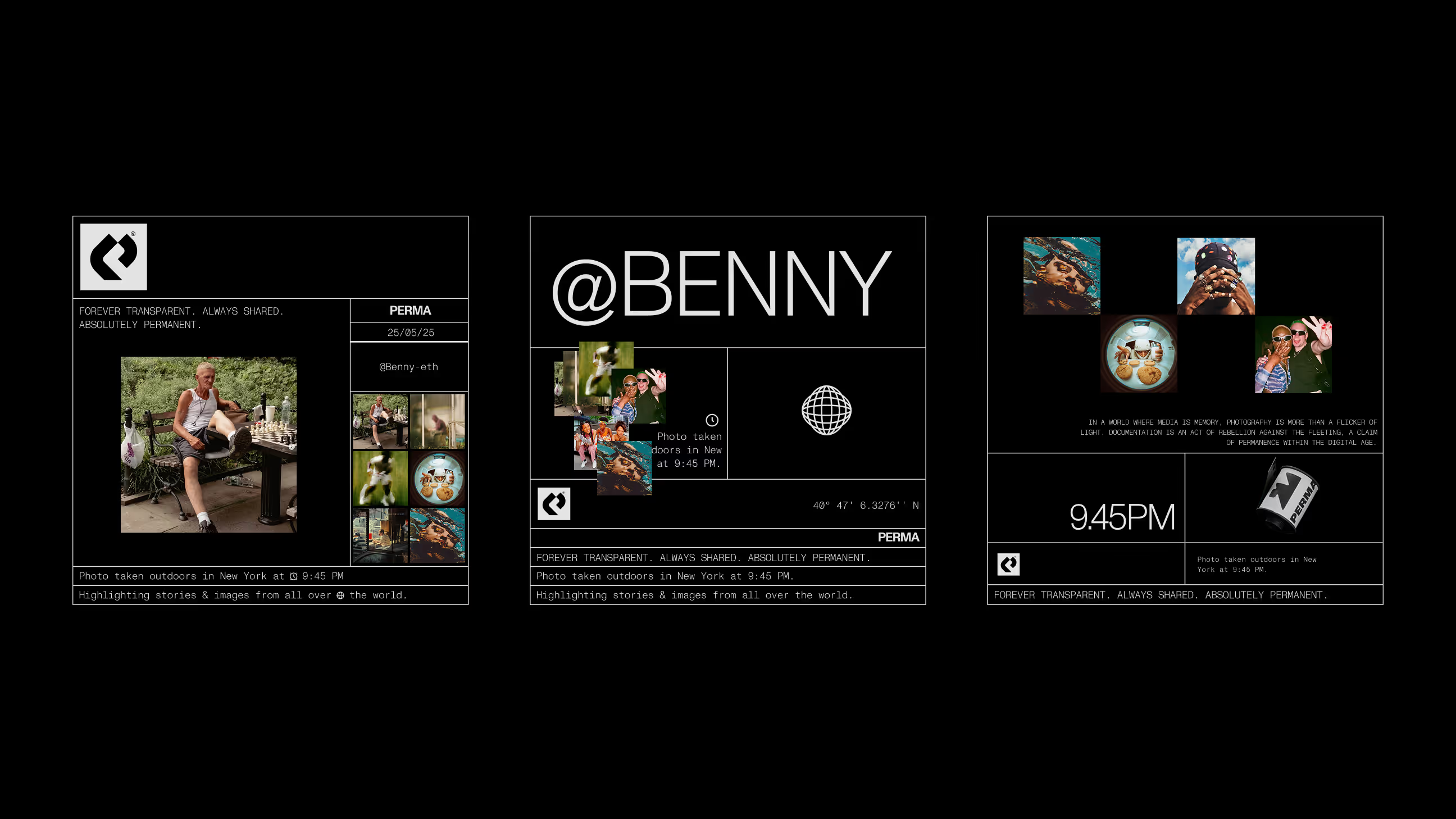
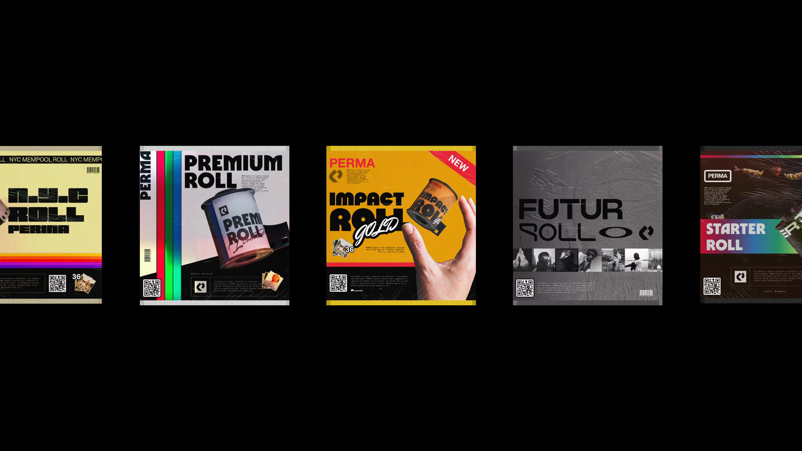
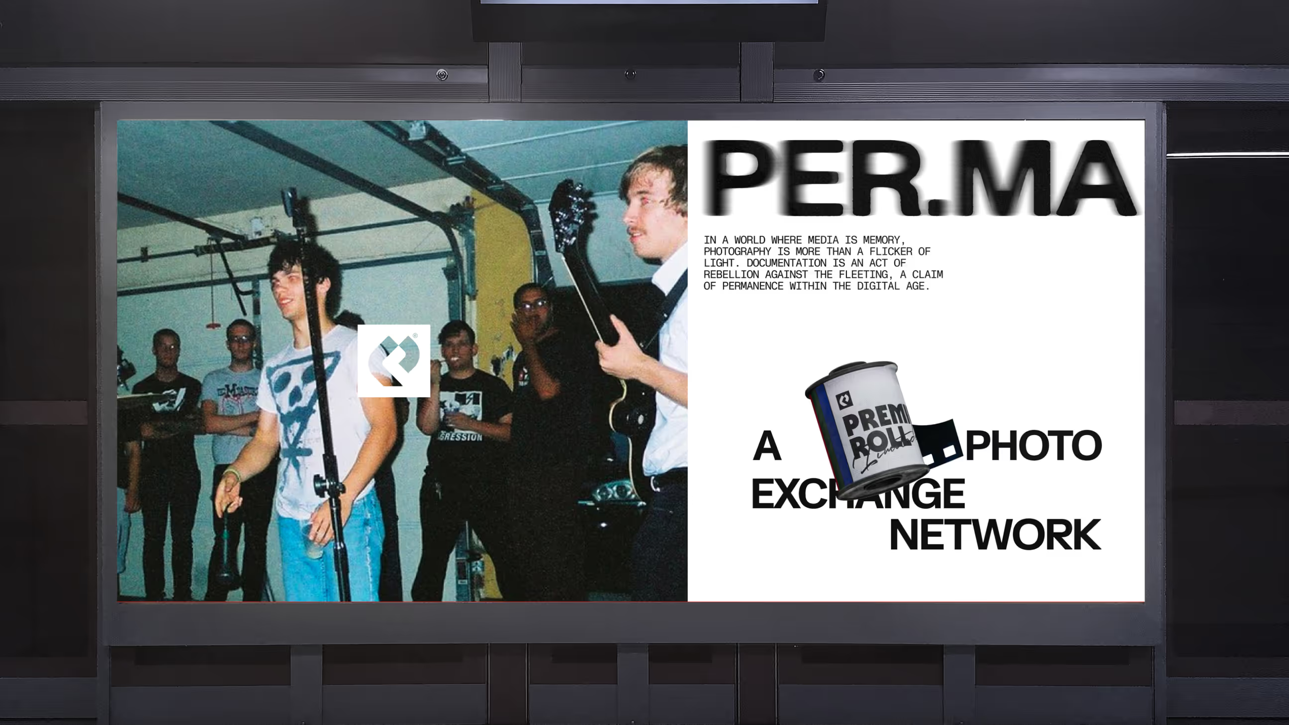
The logo is based on the values and goals of the Perma brand. Exchange is at the heart of its representation, as is the unification of the community. The letter "P" from Perma is integrated into the logo so that users can appropriate it and identify with the brand.


Project Informations
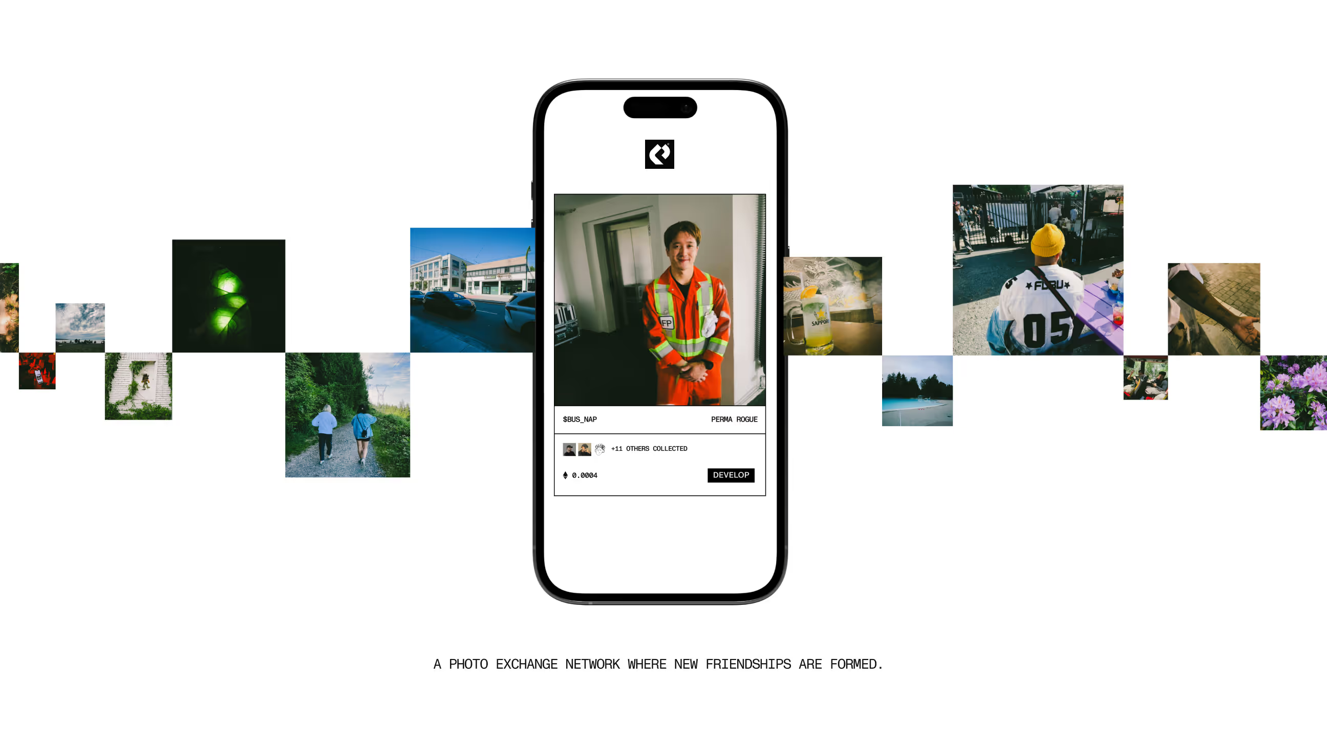
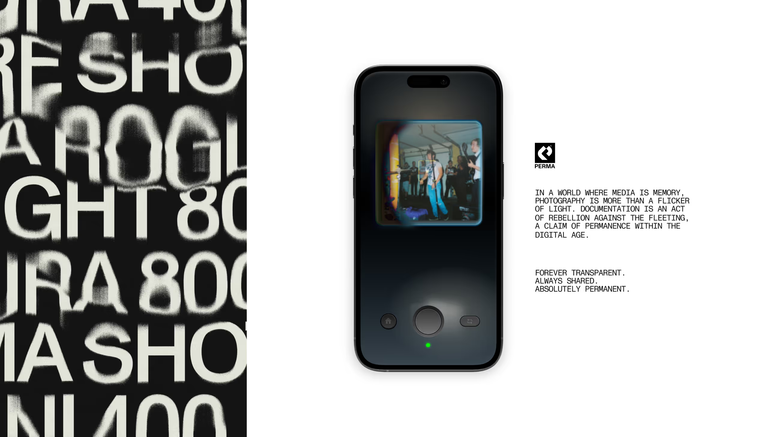
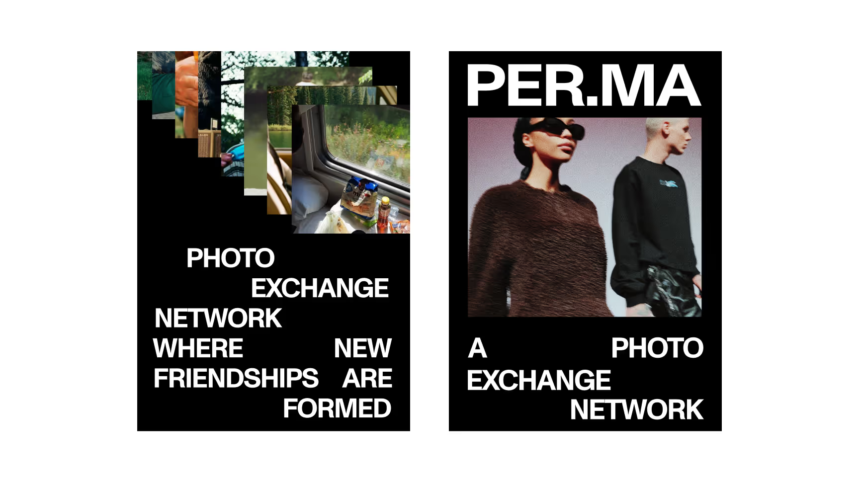
Perma is a social networking app for sharing photos, built around authentic exchange and community connection. In a landscape dominated by a handful of giants, Perma bets on intimacy and real connection to create a more meaningful sharing experience.
anagram created the logo and brand identity for Perma with two guiding principles: exchange as the core value, and community unification as the brand's ambition. The logo integrates the letter “P” in a way that invites users to make it their own, a visual signature they wear as much as they see.
For a consumer app, the logo is often the first and sometimes the only touchpoint before a download decision. It needs to communicate belonging instantly and create a pull toward the community it represents.
FAQ
The letter “P” is integrated into the logo to invite user ownership and identification, a visual signature built around the values of exchange and community belonging.
Logo and full brand identity.
The logo is often the only brand signal before a download decision. It needs to communicate community belonging instantly, making users feel like they want to be part of what it represents.
Feel like working together?
So, let's shake the market! In real life